Flight Preview

Design Opportunity
Pilots have many ways to prepare for a landing at an unfamiliar airport. Often, they will review photos or static paper procedure charts for an airport. We wanted to develop a solution that would help pilots improve their preparation for landing at their destination airport.
Solution
The proposed solution was to create an interactive, 3D representation of an airport, similar to Google Earth. The challenge was creating an easy-to-use tool that actually improved a user's mental model.
Client
Honeywell Aerospace
Roles
UI and UX
Usability testing
MarCom support
Art direction
Visual design
Copy writing
Agile / Scrum methodology
Getting Started
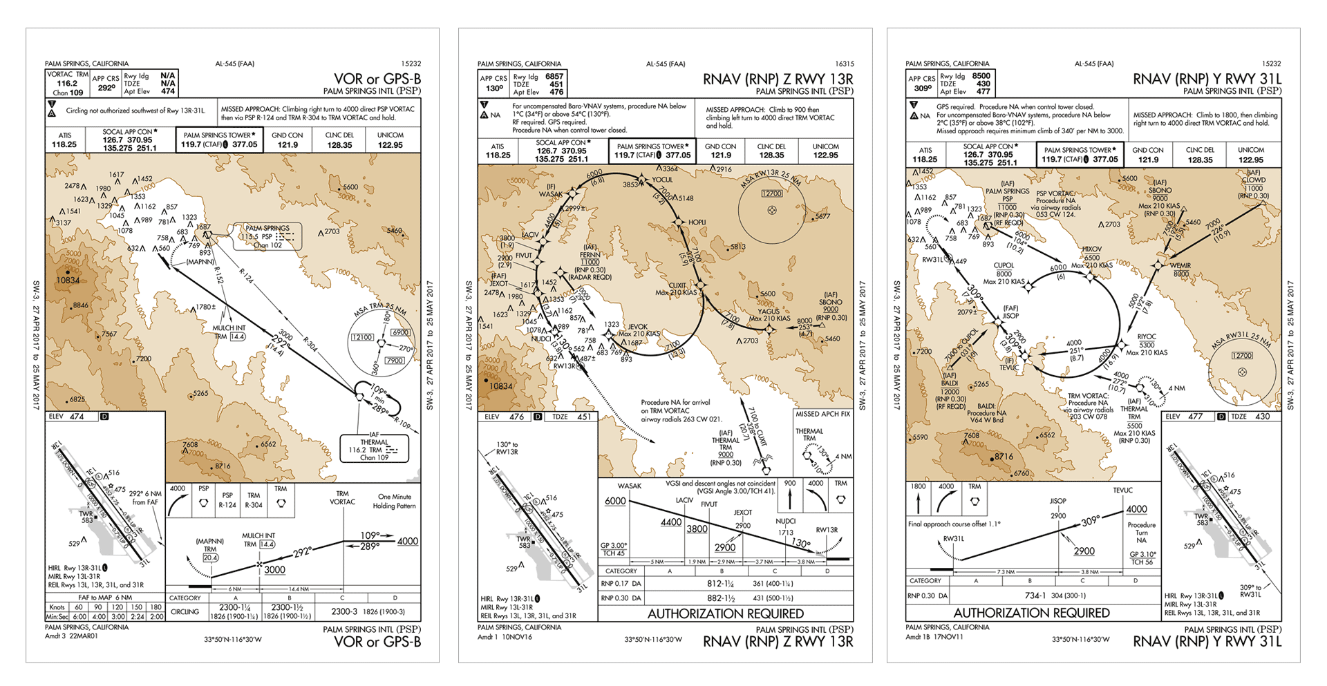
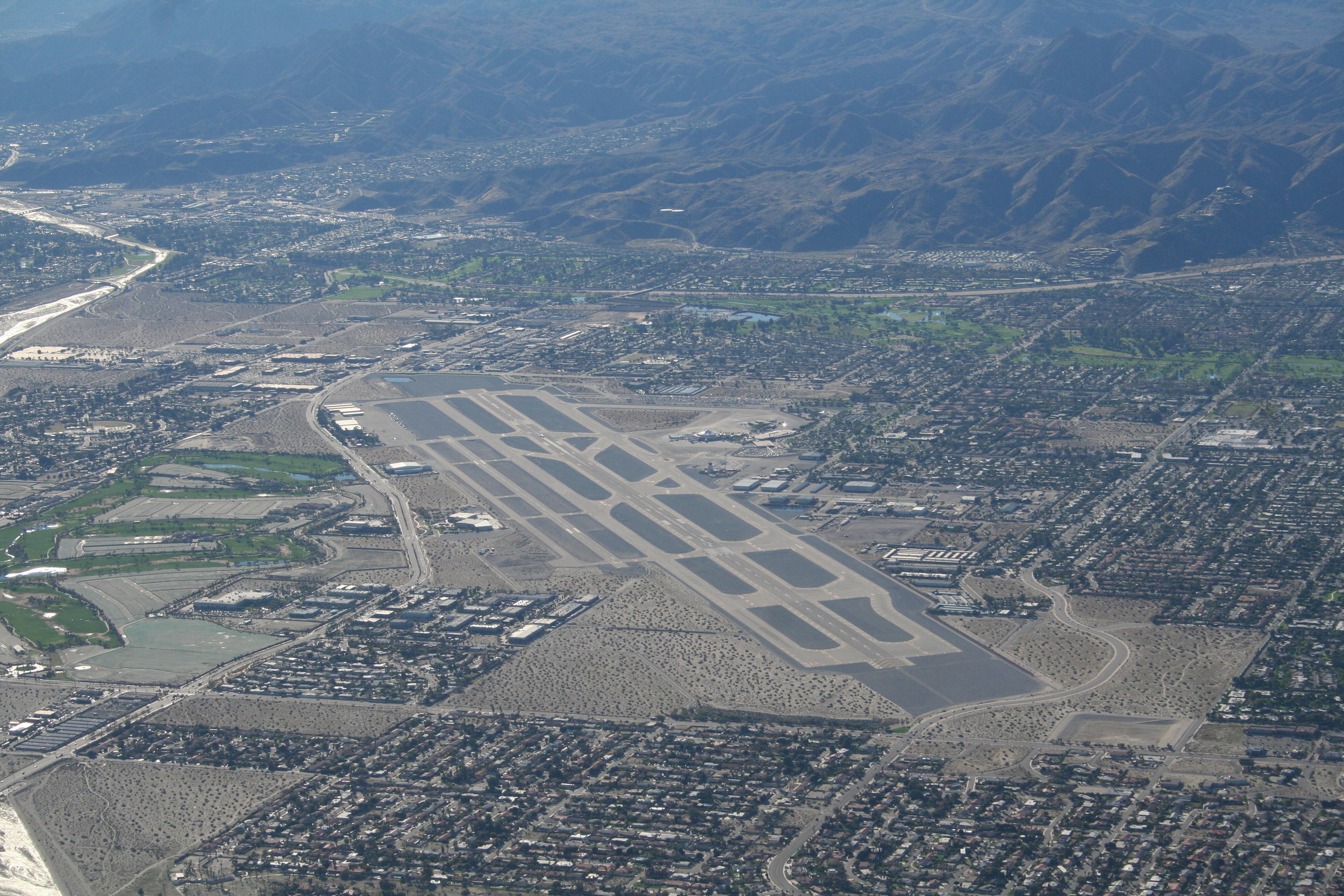
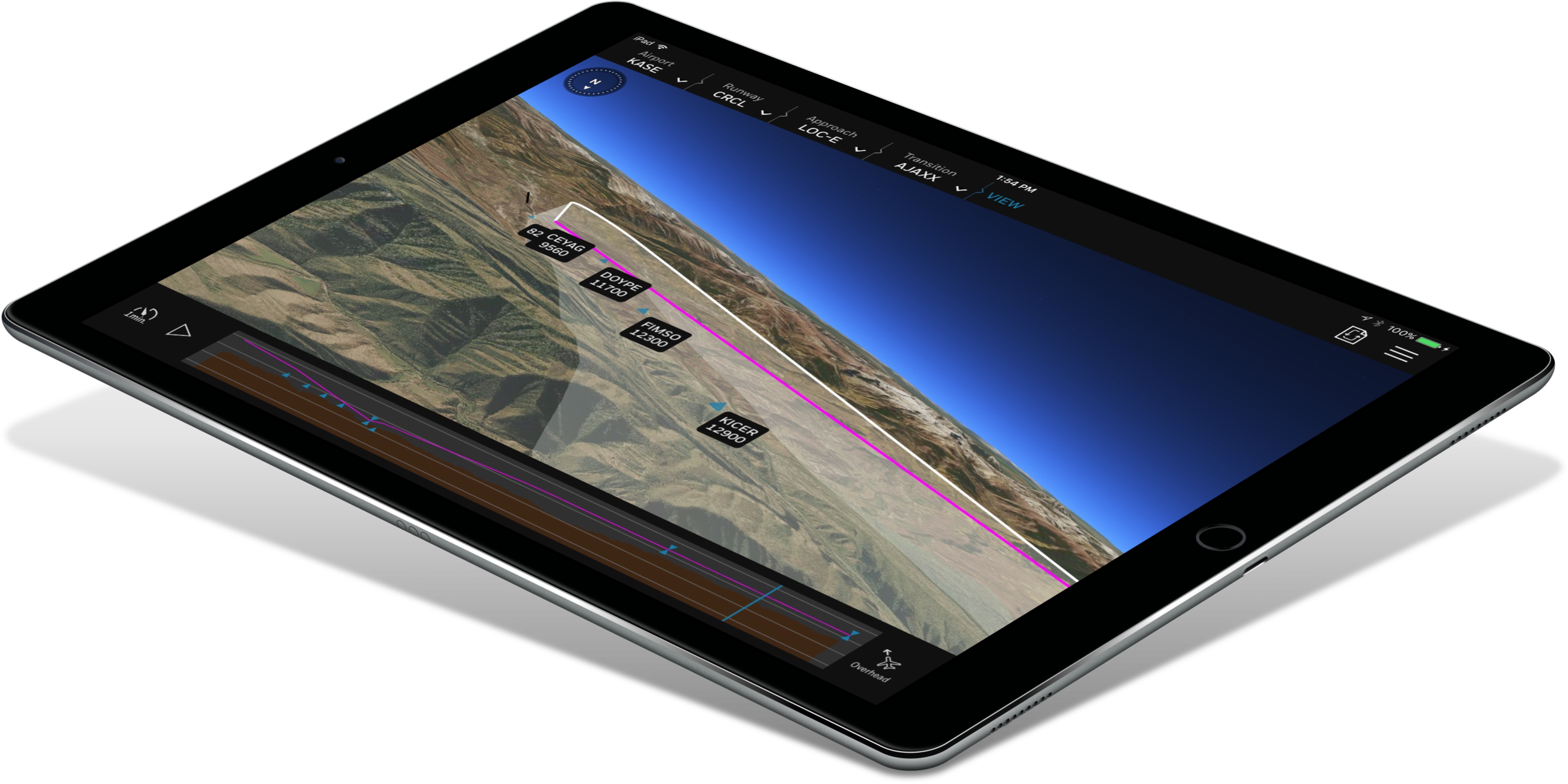
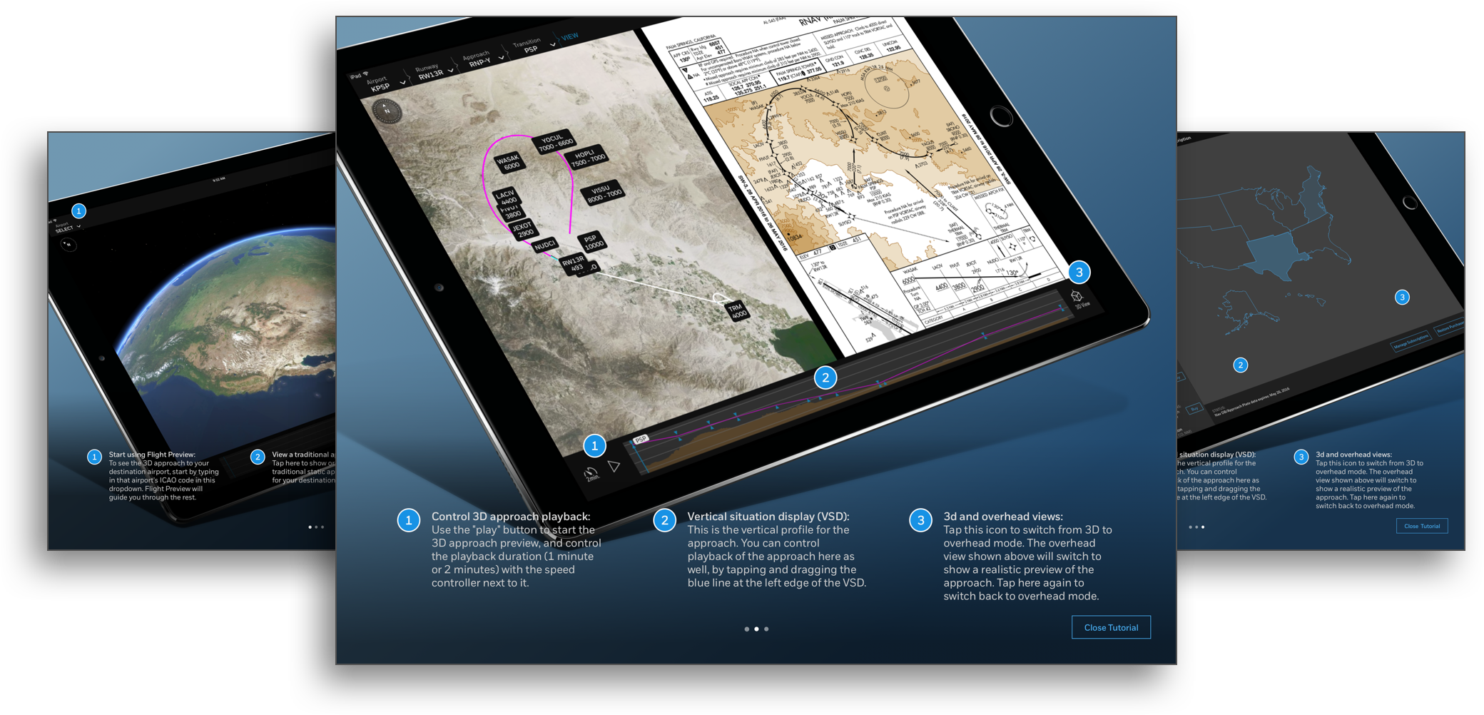
Imagine you are a pilot, flying into a new airport for the first time. As part of your required preparation, you will review approach documentation for that airport. That review will probably be a paper approach diagram (the first image in the carousel below), and some aerial photos of your destination. Maybe you will find a video on YouTube that fleshes things out a little bit.

From those reference materials, you would create a mental model of how the approach must be flown: at what speeds, altitudes and patterns. Sometimes, you will do this for an airport you have never flown into before. Sounds tricky, right?
The Flight Preview team thought we could improve this process with modern interactive tools. Inspired by products like Google Earth, the team’s engineers built a tech demo that would show the user a 3D rendering of their landing approach. It would be interactive, accurate and applicable to any airport.
Here's where I come in. My role was to apply user-centered design principles to the existing tech. I worked with the team to create the iOS mobile app. I like to start with a mind mapping exercise (shown here to figure out flows and functions). From that mind map, we started getting into user flows of greater detail and fidelity.

Main Navigation & User Flows
We created a navigation structure that mirrored the way pilots mentally model an approach. "Building" the navigation allowed us to generate the 3D approach model. Once rendered, we used intuitive gestural controls to allow the user to control the view: pan, zoom and moving in three dimensions.

Competitive Analysis
We knew that we were building a unique (but niche) offering. I helped the team conduct research around pricing, based on a subscription model. Given what we knew about competitor pricing and the scope of their offerings, product conducted interviews with potential customers to derive a price.

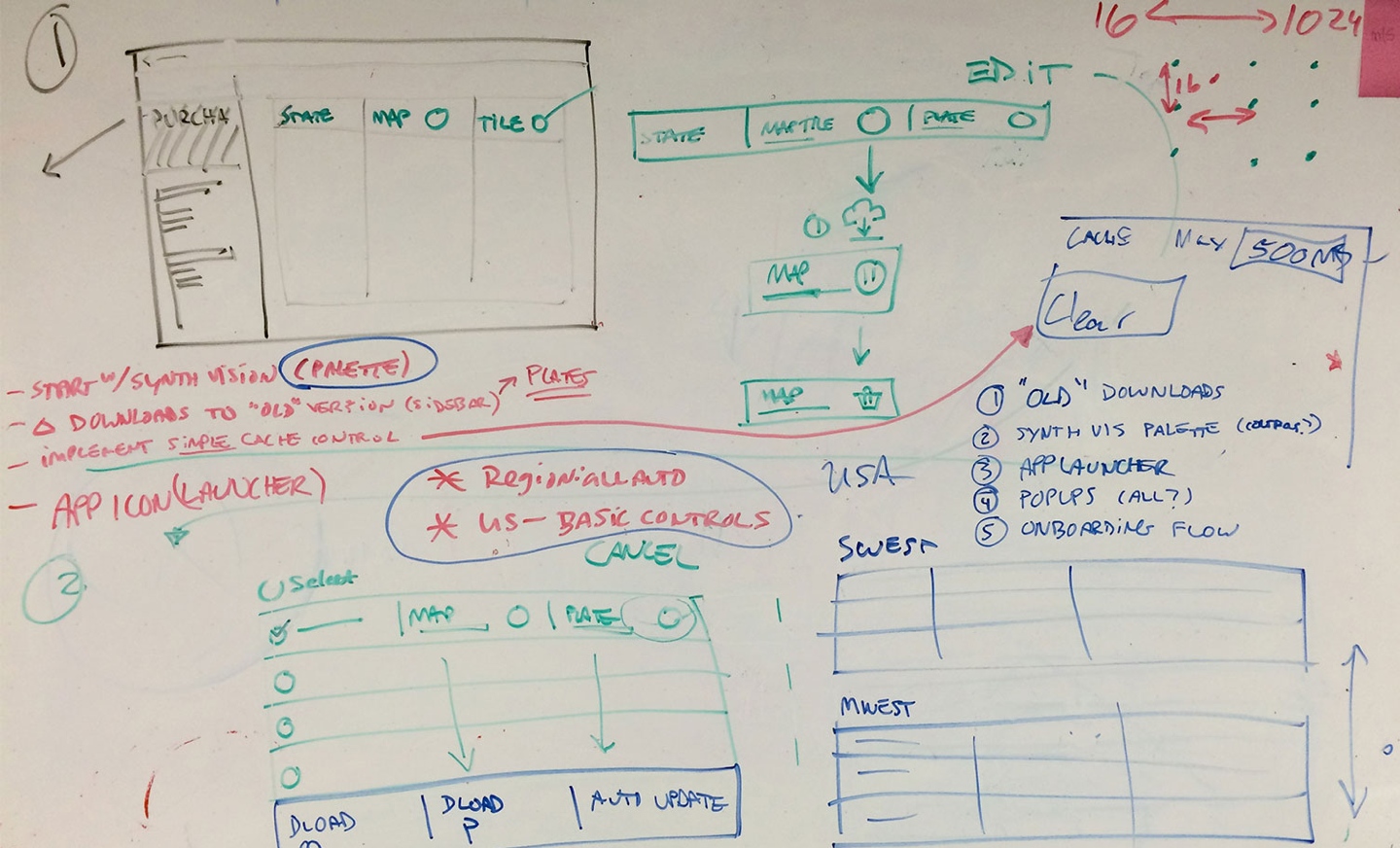
I helped the team create an intuitive method for monetizing the app through data subscriptions. Our users are already familiar with a navigation database update cycle (mandated by the FAA every 28 days), so structuring our monetization strategy around that also made sense. We spent a lot of time whiteboarding out possible solutions for purchasing and data management:
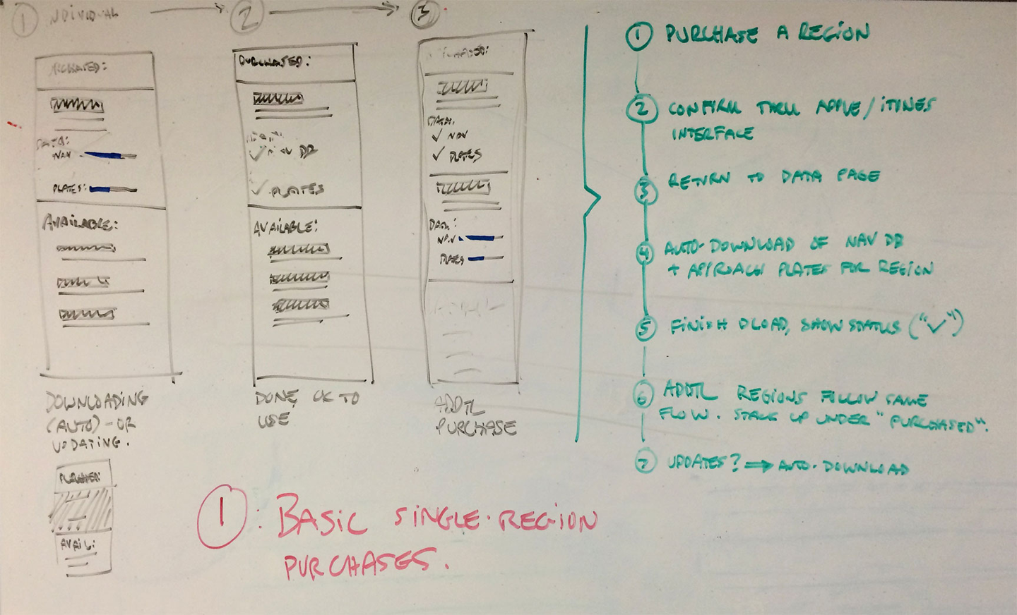
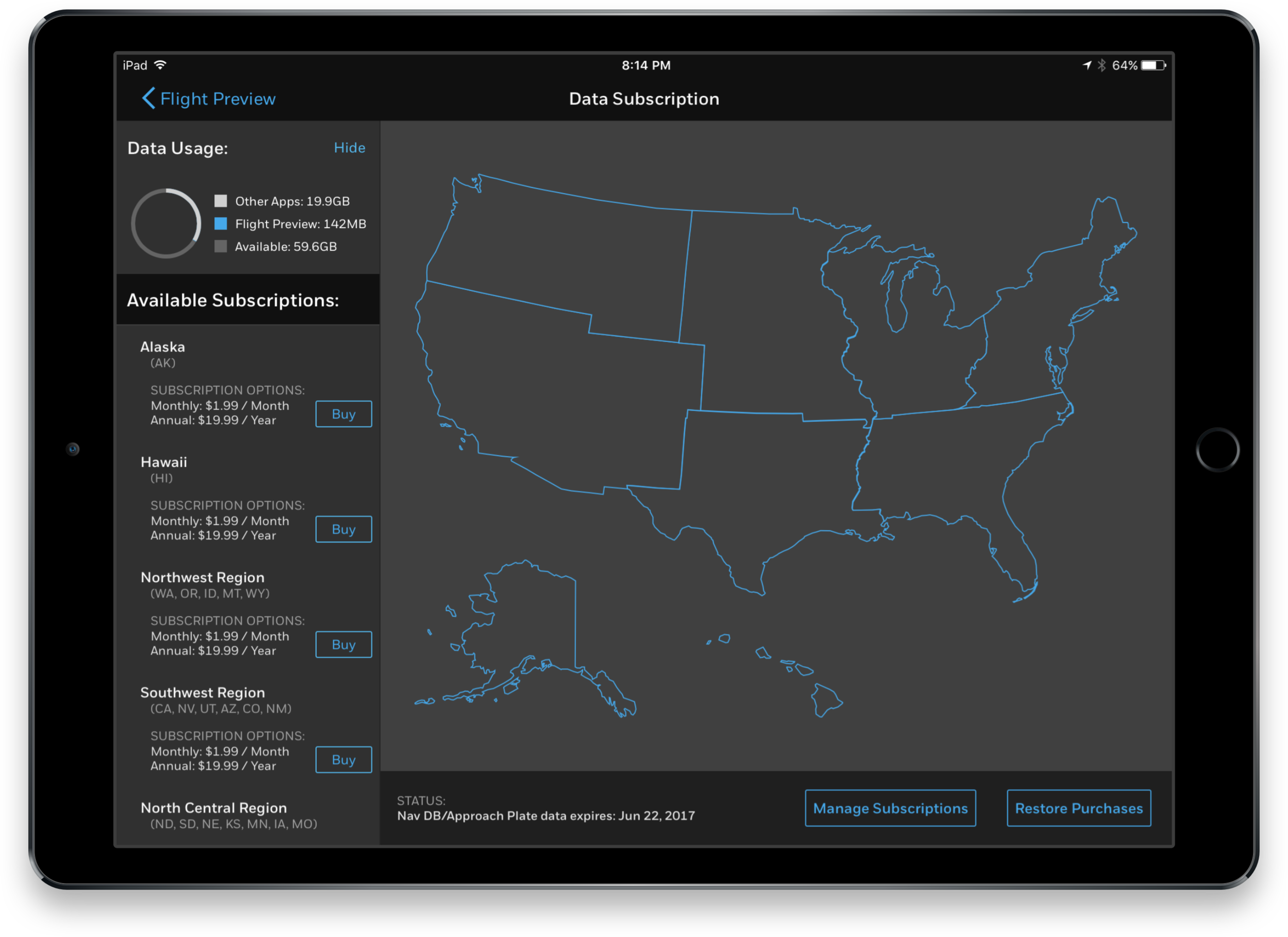
We came up with a pricing table for go-to-market. It can be seen in the alpha screens shown below. Regional data subscriptions make sense for our user base (again, as they expect to receive airport data based on the regions shown here).


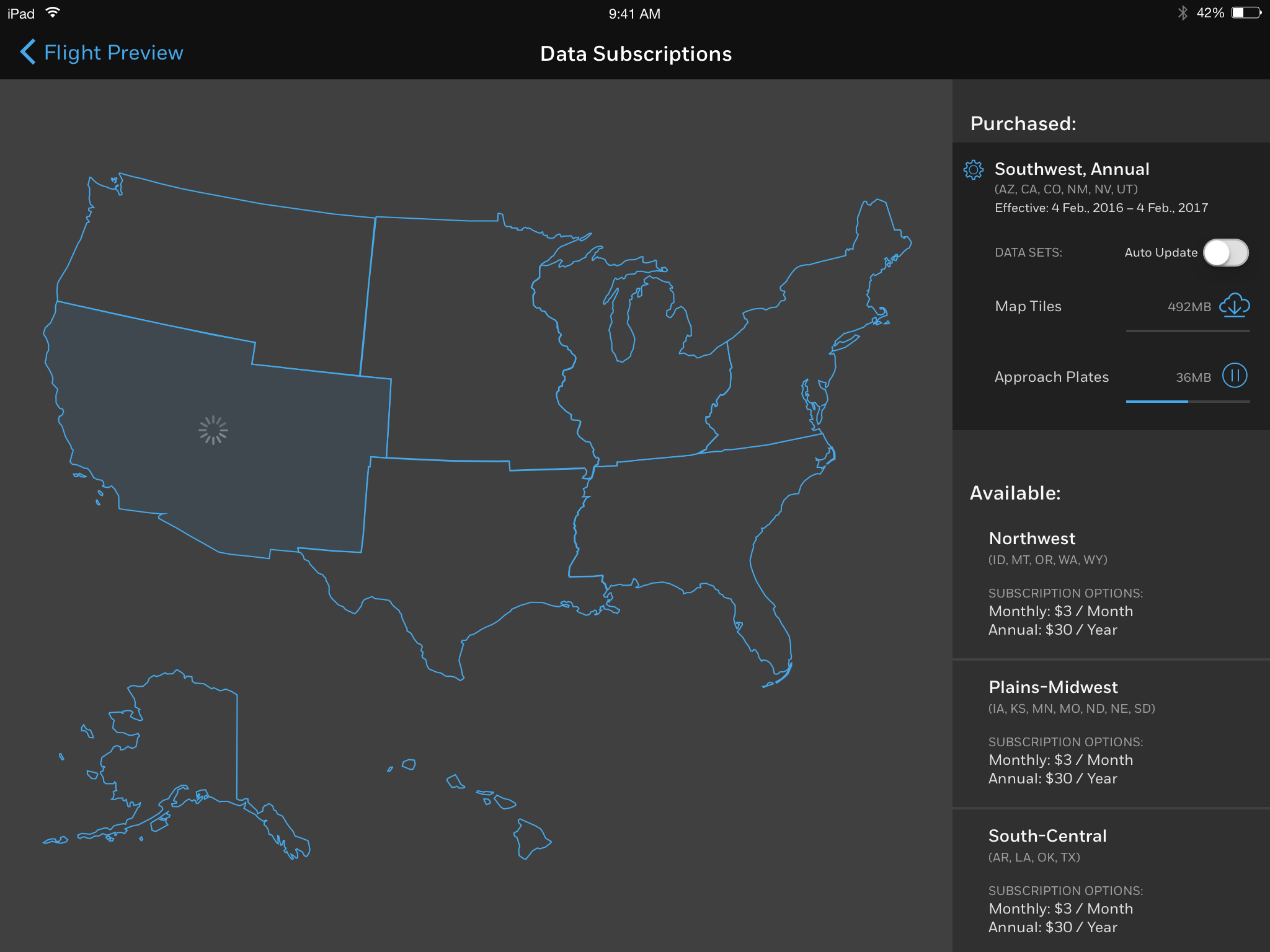


We tested on subscription management, and found that a map showing users what they "owned" was most intuitive. Based on feedback from testing, we also arrived at a fair price/value fit.
Subscriptions are handled through the Apple app store: we were glad to pay the "Apple Tax" because there is so much value offered by the App Store as a distribution and marketing mechanism.
Usability Testing
We had an alpha build ready by this point; we used it to conduct usability studies and test our assumptions. I utilized the "Krug Method" (after Steve Krug's "Rocket Surgery Made Easy") to test prototypes with low overhead. Our user base (pilots) are notoriously hard to get a hold of, so we had to be lean with our testing methods. I created a targeted list of scenarios to test on: the things we thought might present the most friction to an end user.


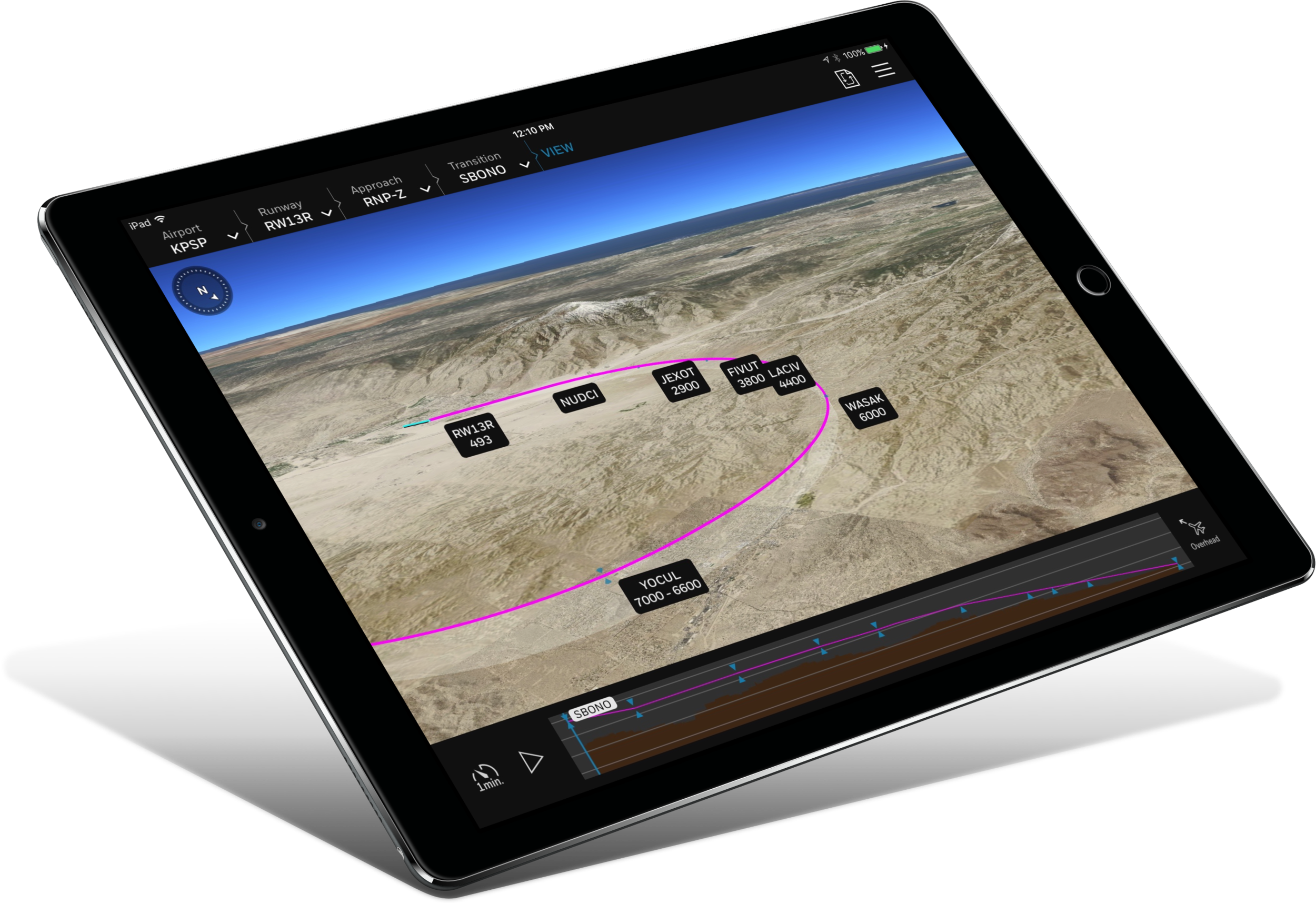
Some of our assumptions were validated: in particular, our concept of navigation and 3D interaction were well-received. What needed attention was the "spit and polish". Users thought the simple 3D view we initially presented didn't do much to improve their mental models. They wanted something more realistic than the view shown here:

The view shown here is what we developed initially and tested on during pre-alpha and alpha releases.
Feedback & Improvements
We partnered with our 3D mapping engine vendor for an intensive one-week "hackathon" to help improve the 3D experience. From here, we addressed other key user feedback and moved into Beta.
Beta
I worked with the team to integrate usability metrics as part of our Beta strategy. At the time, Honeywell used SUS and NPS as our metrics (since expanded to include others). I constructed the SUS survey using Qualtrics to gather and track responses, along with proposing an automated Beta feedback campaign driven by Honeywell's marketing automation software.
We sent out about 40 beta invites, half of which became active users. Of that user base, the spread shown here completed a SUS and NPS survey, as well as giving additional detailed feedback throughout the beta period.

I mapped out an automated feedback gathering campaign. Though we didn't use it for Flight Preview, a similar flow was later adopted for other Honeywell apps. Product engaged in open feedback loops with testers for further data. Based on this, we performed a final round of optimization on the app and were ready to release.
Go-To-Market
You can create a great app, but if you can't market it properly, no one will use it, and so I worked with product and MarCom to create the Flight Preview go-to-market strategy and supporting campaign materials. I also worked closely with the Flight Preview team to support their app store deployment needs. Some of the things I did to support our go-to-market included:
Copy writing (web presence, video, email, print)
App store presence (keywords, copy writing, image creation)
Visual design (MarCom materials)
Art direction (MarCom materials, web presence)
FAQ / onboarding (web presence, in-app)


Flight Preview was one of Honeywell Aerospace's more successful mobile apps. More importantly, many of the Agile user-centered methods we pioneered were adopted (and improved upon) by other Honeywell app teams.