Oceanic Crossing Mobile App
Design opportunity
Digital oceanic crossing logs for business jet pilots.
Solution
A mobile app for displaying and annotating trans-oceanic flight plans.
01 – Design opportunity
Business jet pilots fly all over the world. Whenever they cross an ocean, safety regulations require that they log that crossing.
At the time we designed this, oceanic crossing logs were often created and maintained by hand with paper maps and printouts. Storage and data entry for oceanic logs could be a pain point. This whole process falls to pilots, who'd rather be flying than doing paperwork.
We proposed an electronic flight bag (EFB) application that would:
Ingest, parse and display trans-oceanic flight plans.
Manage the logging process, making it faster, easier and more accurate.
Store and share oceanic logs.

02 – Early research + concepts
At the time, pilots received trans-oceanic flight plans electronically, or as hard copy. The electronic flight plans were often printed out, and used during preflight planning. So the preflight confirmation step of oceanic crossings was often a paper-based, physical process.
We looked at the journey and started working on the initial pain point: getting a flight plan into a device. The first step in the process usually occurs well before a flight, on the ground. We felt like a phone–with its persistent data connection–would be a good target device.
We wanted to address getting a paper flight plan, with all its data, into an electronic device. Our engineers had some experience with optical character recognition. Part of our proposal thus included the ability to "scan" a flight plan and render it inside the device.
While the engineers worked on the scan-and-parse feature, I started defining the experience.
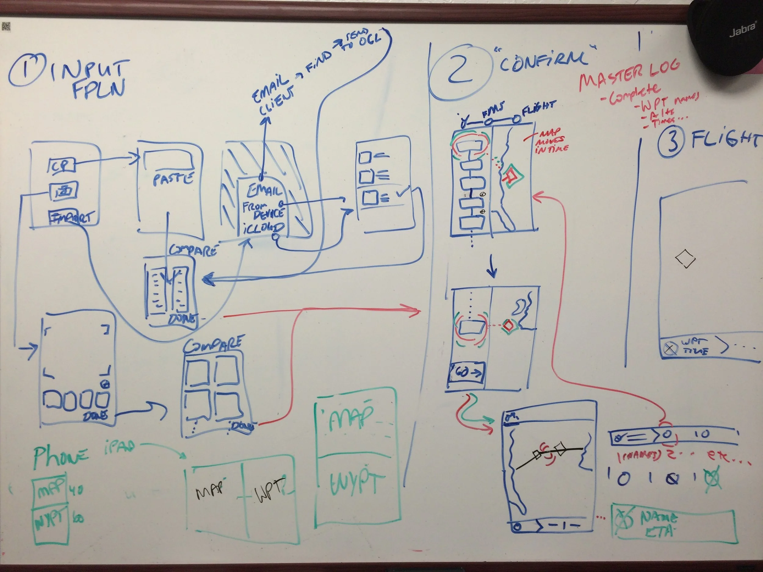


We invited feedback early on, during our initial sketching and concepting phase. This helped us determine which features were desirable.
I refined those early sketches into a rough application flow, which we again shared with our stakeholders:
Early feedback sessions like this – with rough prototypes – helped determine what to build. Inviting stakeholders to the design process early helped them feel invested in the outcome.
One challenge we faced at this stage was to decide whose feedback we were going to incorporate. Internal stakeholders (business leadership) might have different priorities than end users (pilots). We opted to design major features that seemed to add the most value to our end user, and justified those choices with the business.
03 – Prototyping + results
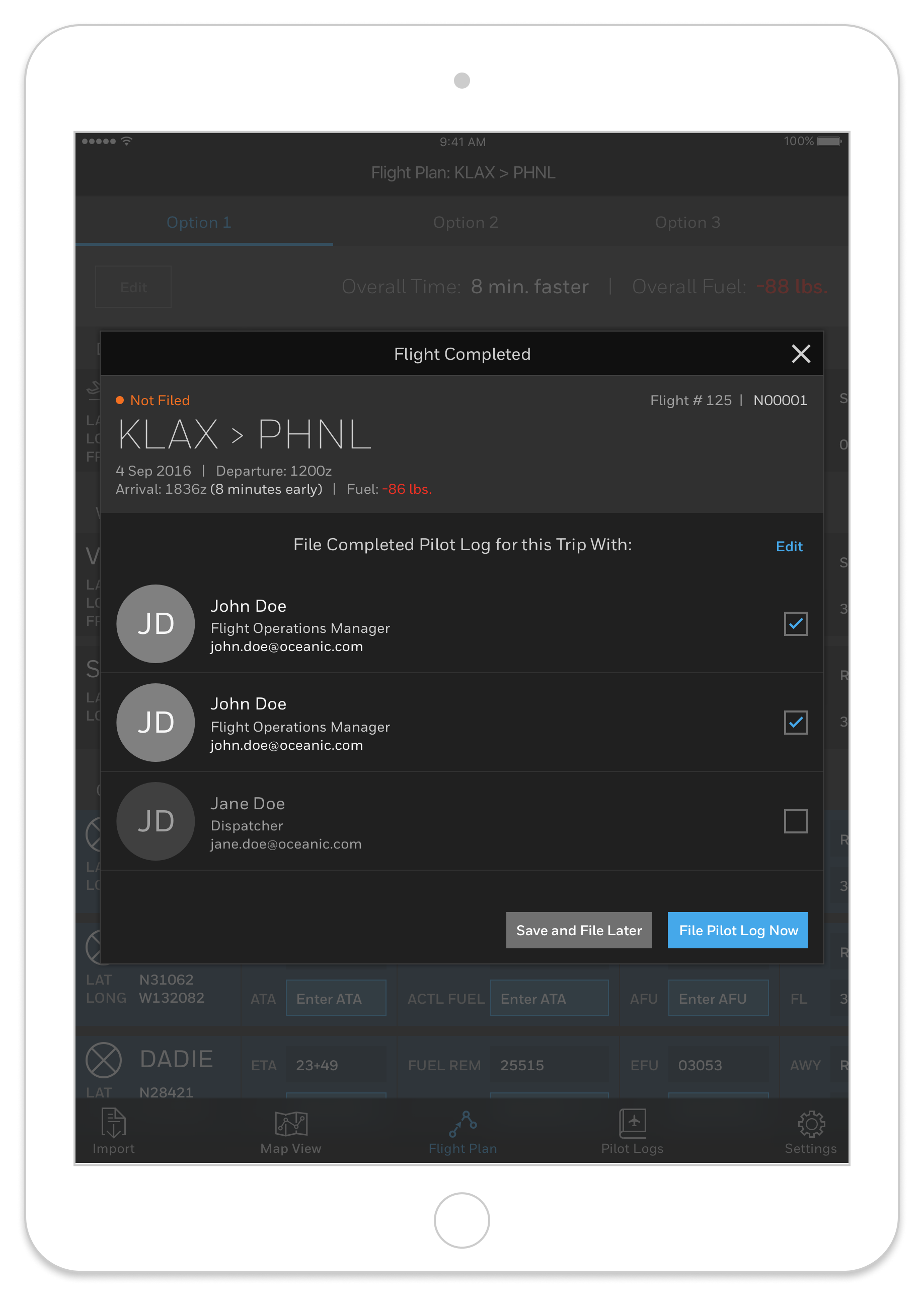
At this point, I felt there was enough to go on to begin more refined prototypes. I created a prototype "happy flow" experience centered around the preflight confirmation process.
We took this prototype out again for further feedback. Now we were testing the usability of our proposed solution:
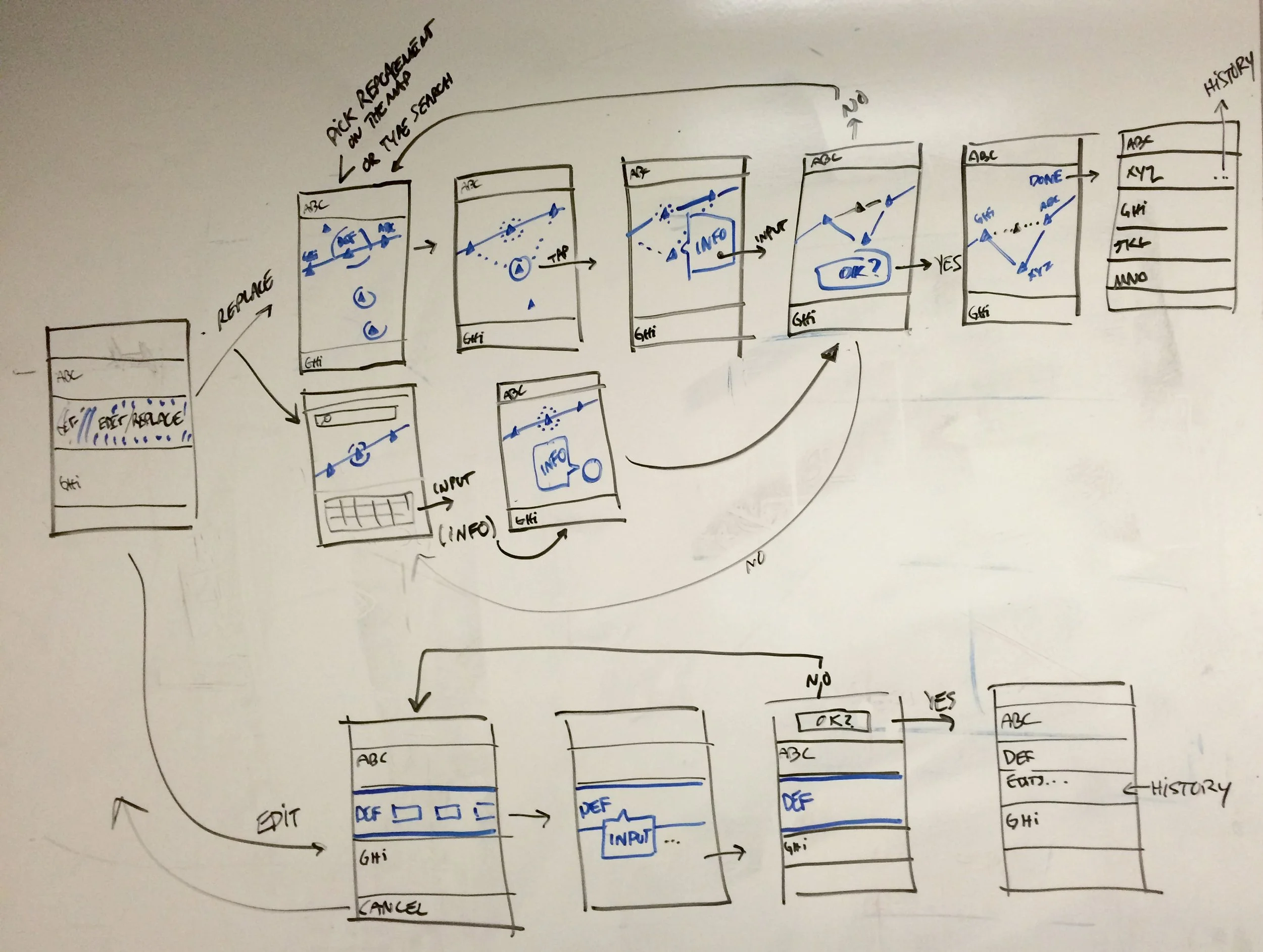
04 – Back to the whiteboard
We received positive feedback during testing – the proposed solution was desirable. However, we found some usability problems in our first prototypes.
We decided at first on phones as the device type, because their persistent data connection would ease retrieval and import of flight plans. But, the majority of the work done in the app–mapping, checking waypoints–felt clunky on the phone’s small screen. Pilot testers were vocal about not wanting this solution on a phone.
As a product team, we decided to pivot to developing with iPads as the target device. Their larger screen afforded data entry and mapping improvements. Additionally, pilots were already used to working with an iPad in the cockpit. We wouldn’t be forcing them to switch devices for admin tasks if our solution lived on a device they already used.
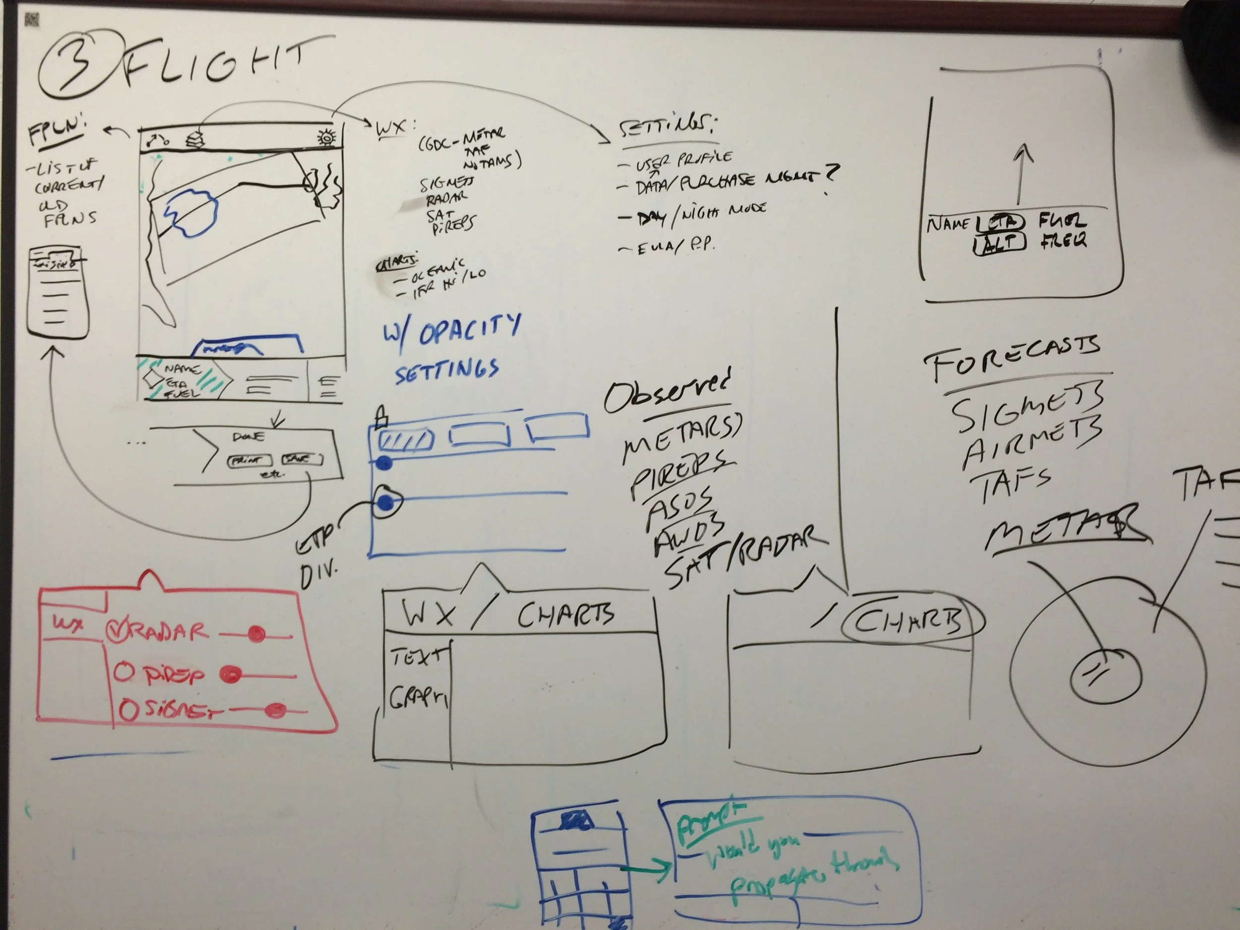
I went back to the whiteboard with these findings and iterated on the design with an iPad as the target device:
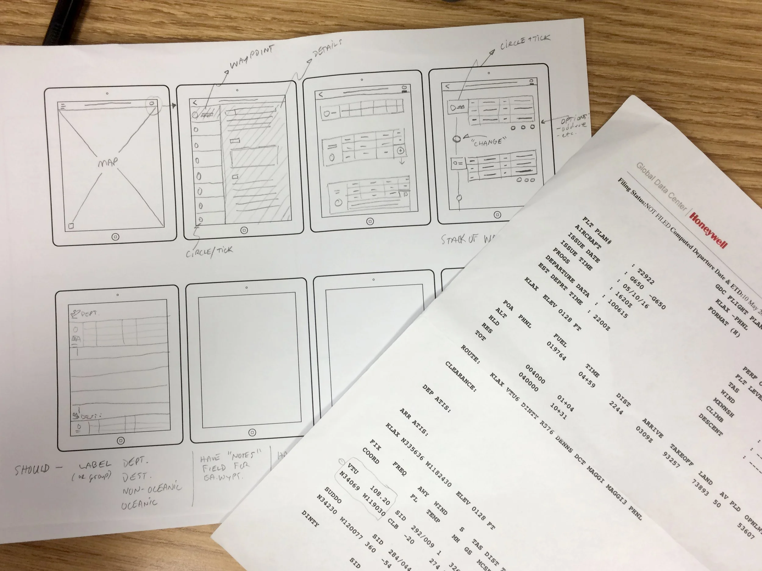
Then I redid the application prototypes with an iPad as the target device type. Once I had completed the prototypes, we again took them out for further usability testing.
We wanted to be sure that the larger device allowed for easier use, especially when working with maps and entering data.
The video shows a brief walkthrough of the core application features. I again tested the app with pilots, and collected more findings. Here are a few notable quotes and observations from the iPad prototype testing.

05 – Next steps
We had learned that there was definite interest in the app. It addressed a cumbersome paper-based process, with a device that pilots were already using. Our decision to keep some of the paper metaphors – the "circle and tick" – helped with usability.
There were several pilot-facing mobile apps in development at Honeywell at this time. The business decided to combine all the apps into one. Some apps would become features, which we would charge an additional fee for. Our team began integrating the oceanic crossing designs shown here as a premium feature of the new, unified pilot’s app.