Fender Blacktop Guitars

Design Opportunity
Fender guitars needed a branding campaign for a new series of products: the Blacktop series required a unique brand presence within the larger Fender pantheon.
Solution
I created a visual branding solution that embraced a no-nonsense, DIY aesthetic.
Client
Fender Musical Instruments, Inc. (FMIC)
Roles
Visual design
Art direction
Branding
Advertising
MarCom material creation
Background
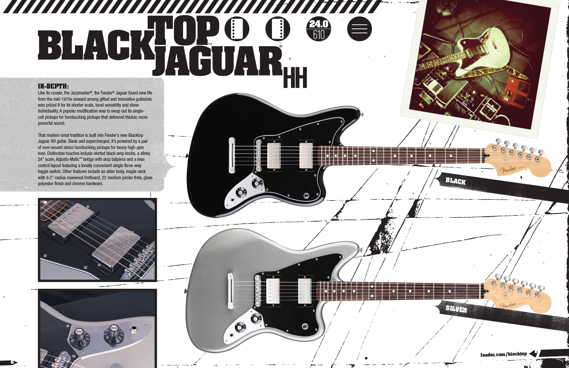
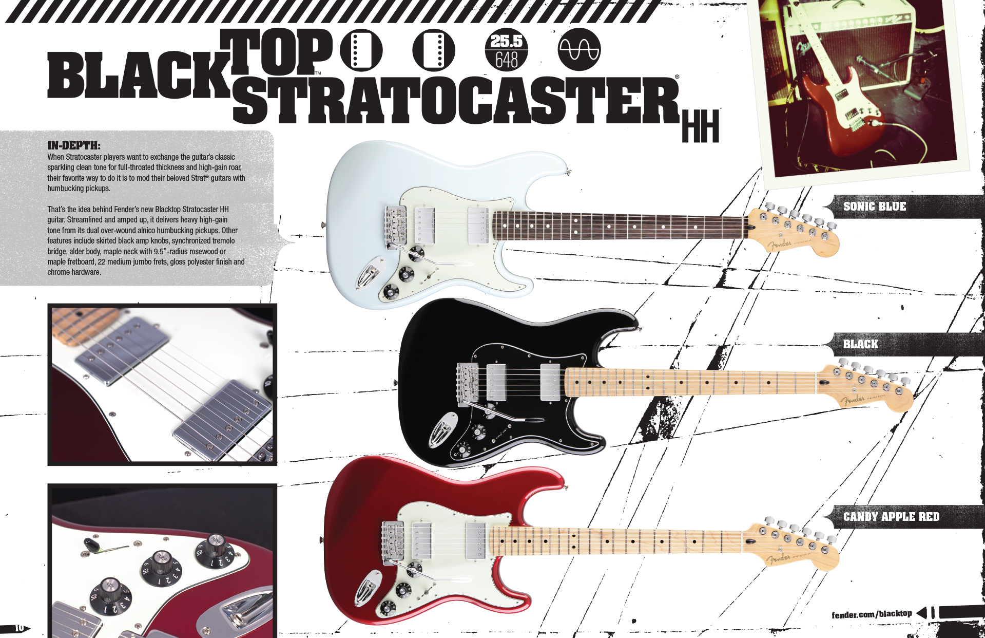
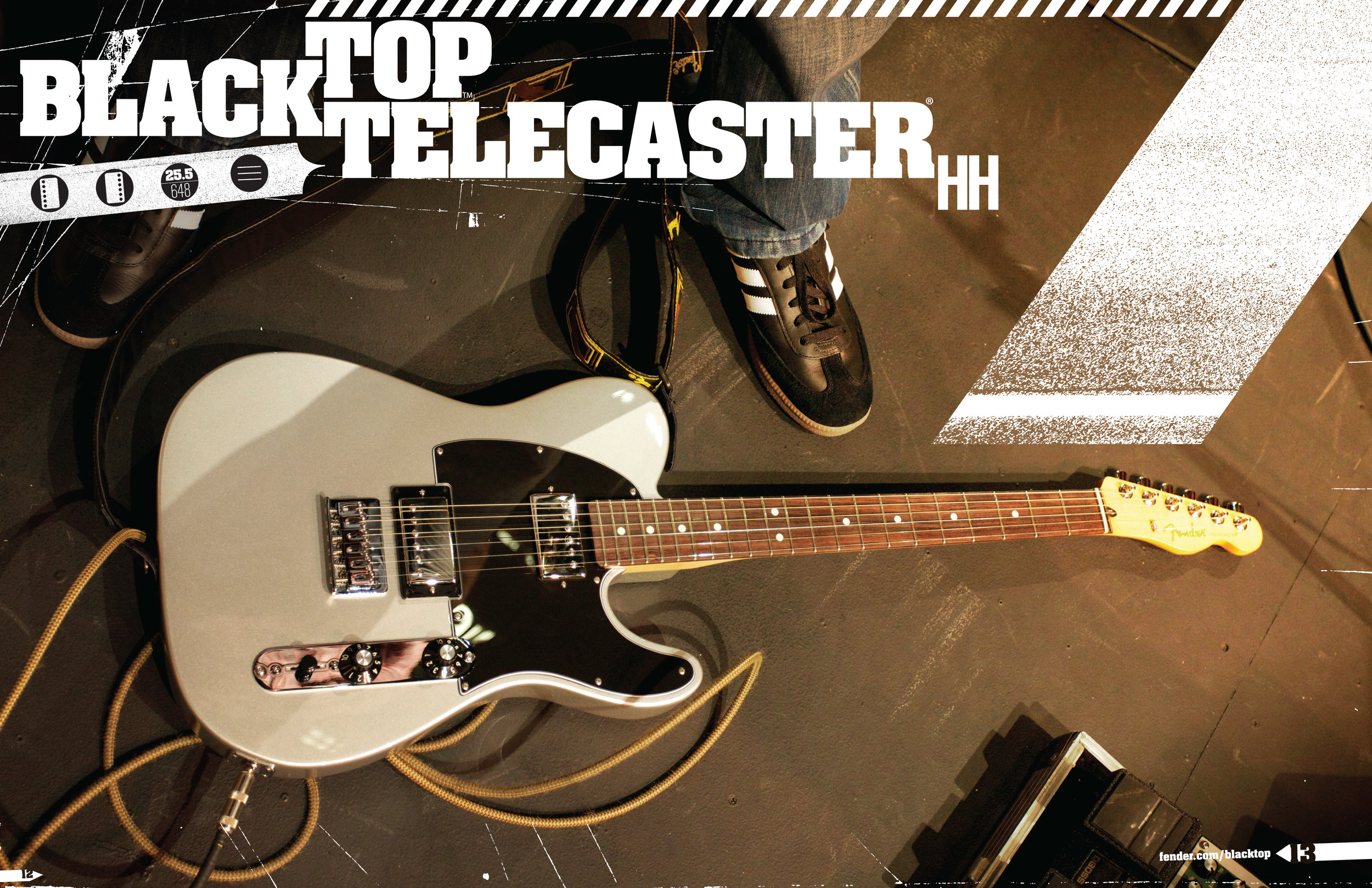
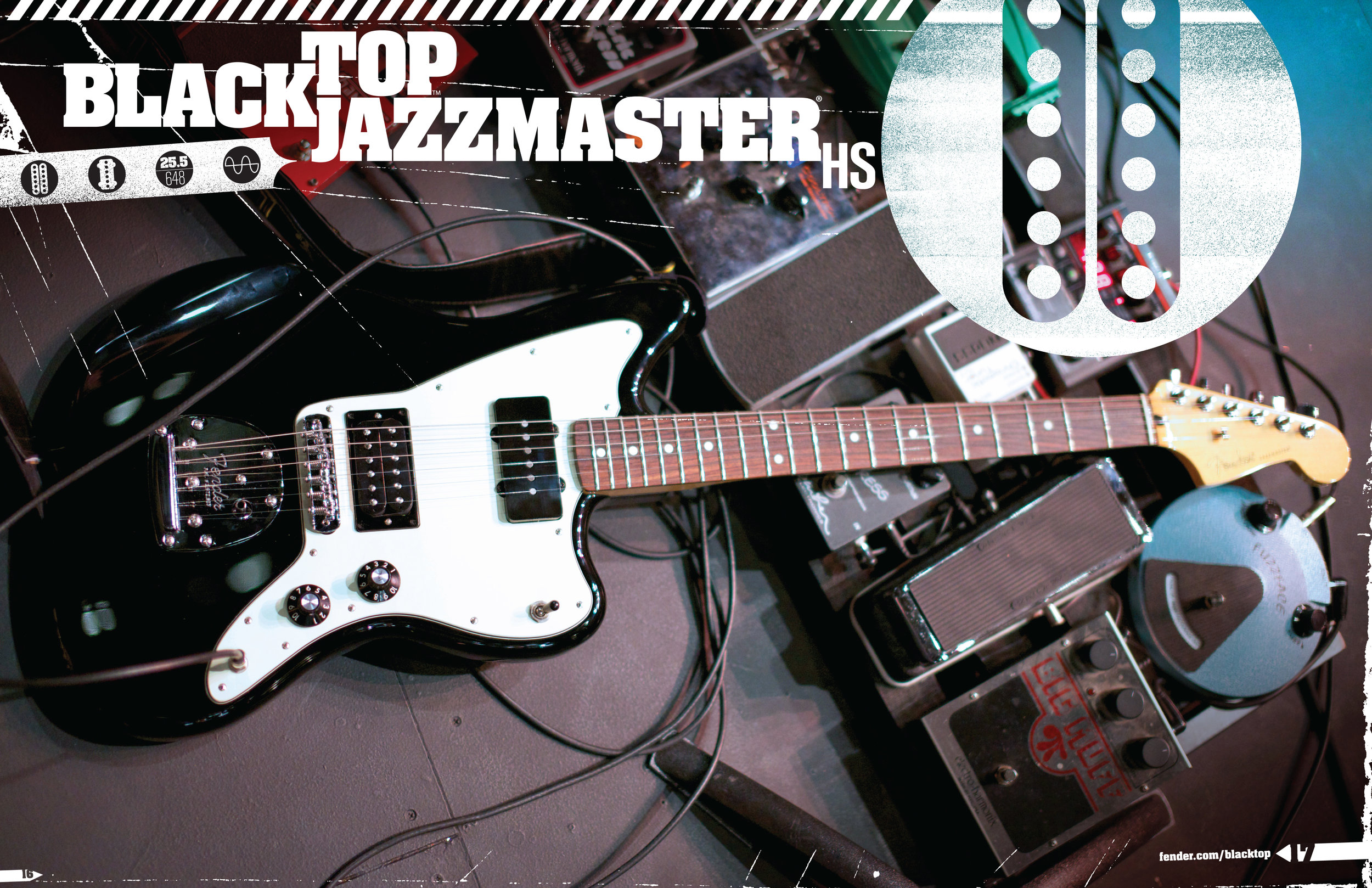
Fender developed the Blacktop series to redefine instruments that hadn't changed substantially–due to their success–in over 60 years. The challenge was to brand the series uniquely, and respect the parent company's visual language.

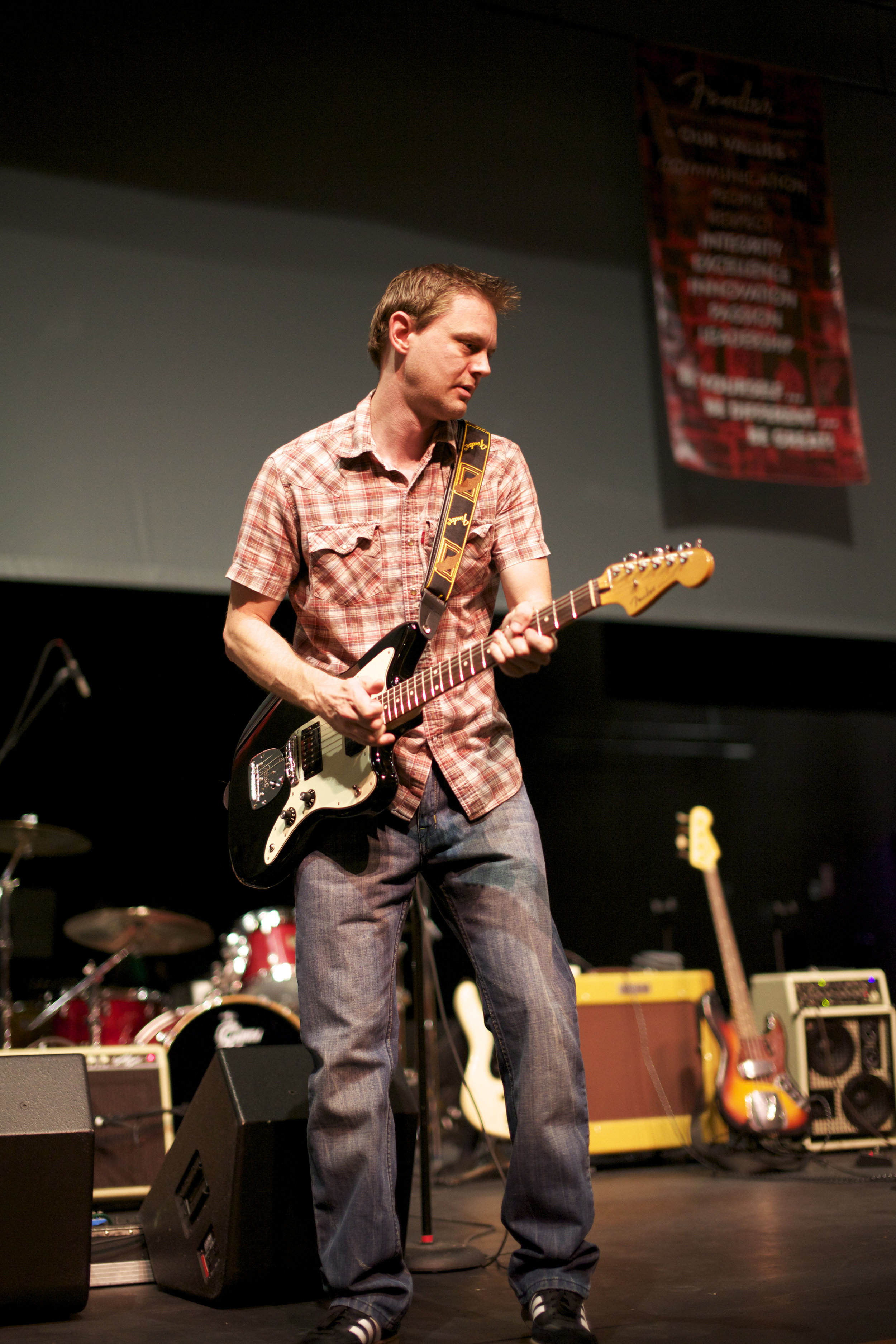
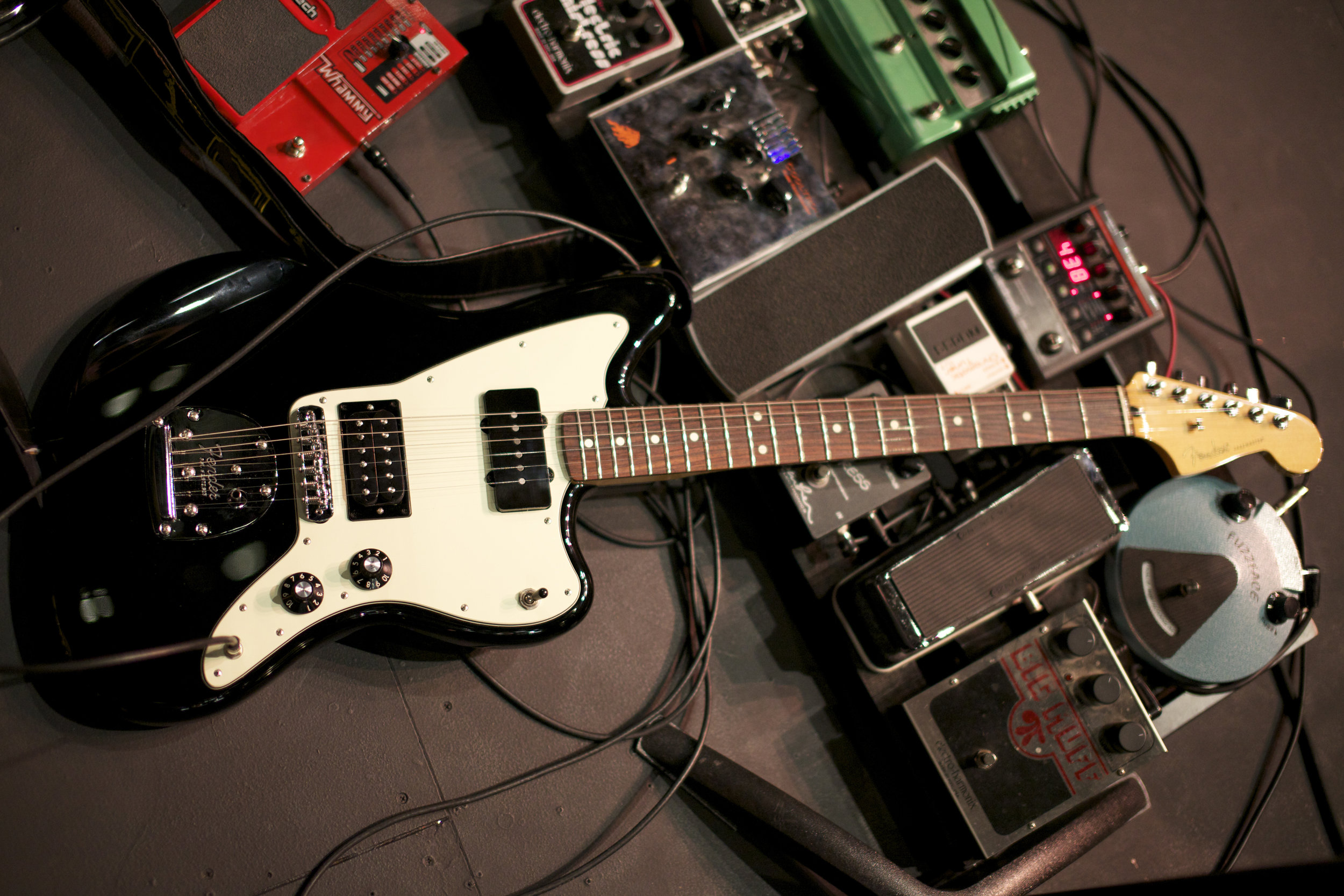
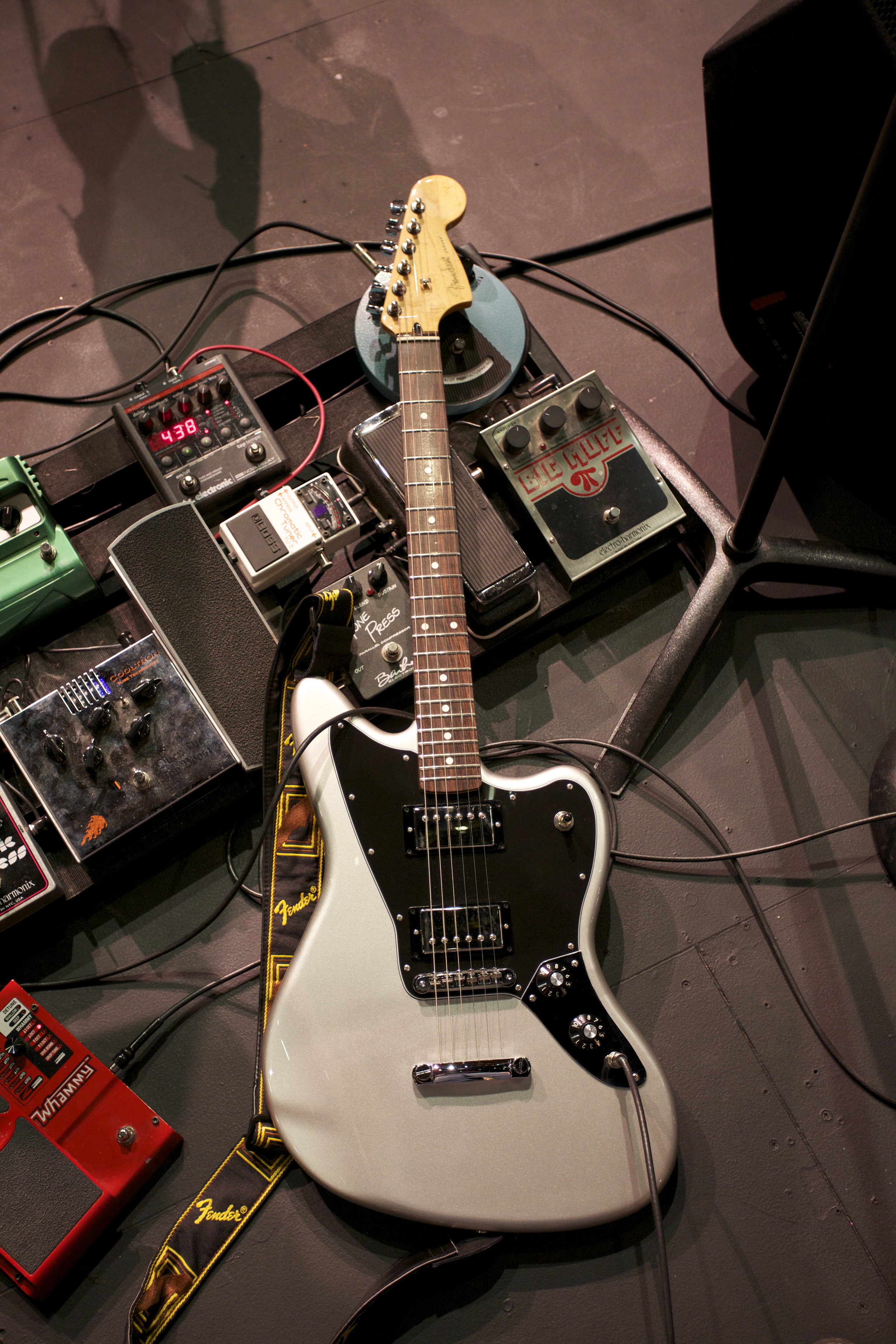
As rock music evolved over time, players would "hack" their instruments to produce the sounds they were looking for. This practice was especially common to Fender instruments: their modular nature makes it easy. The Blacktop series was designed to pay homage to this historical tendency. In essence, they came out of the box "pre-modded": incorporating some of those time-honored hacks into a brand-new guitar.
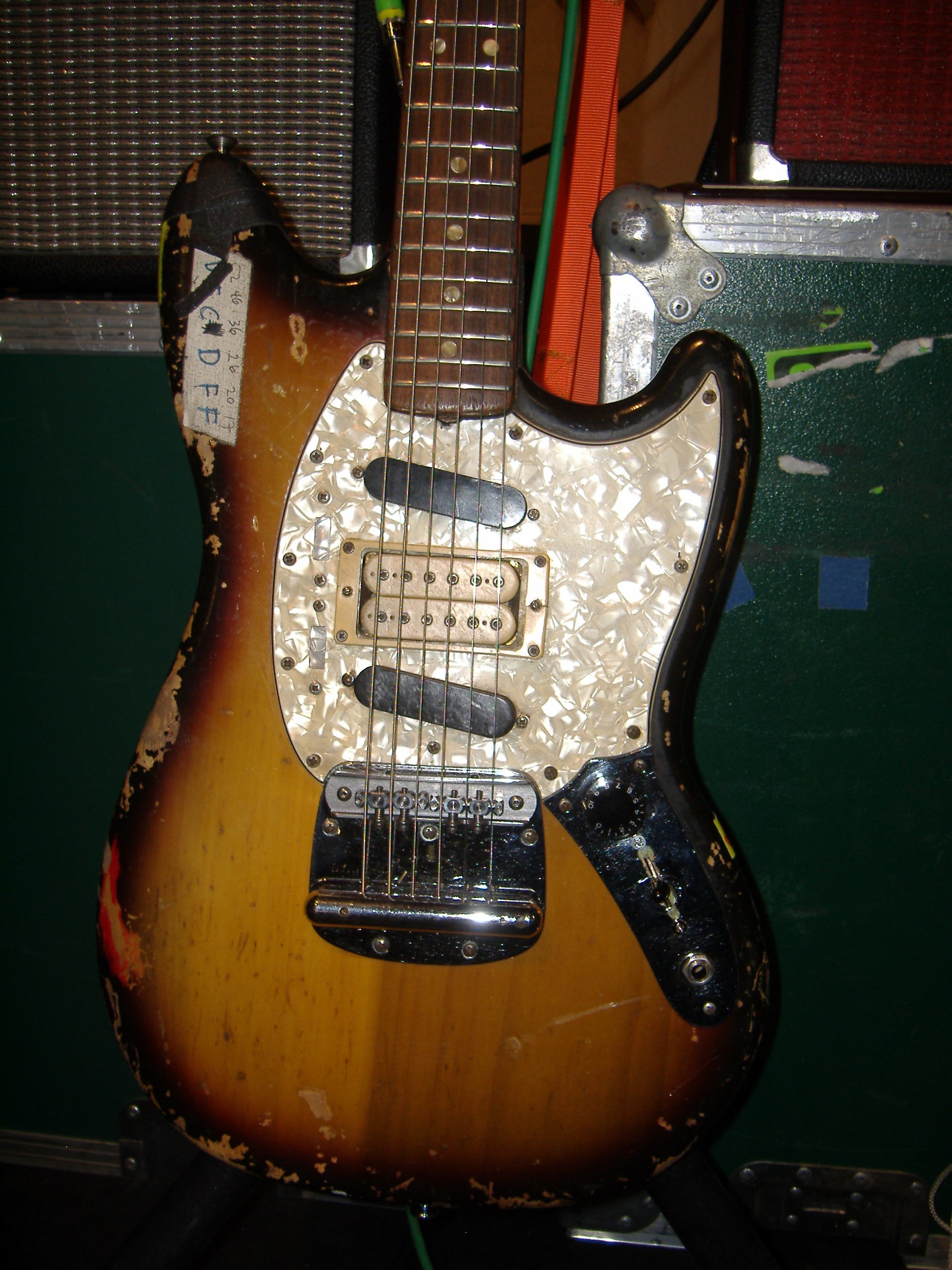
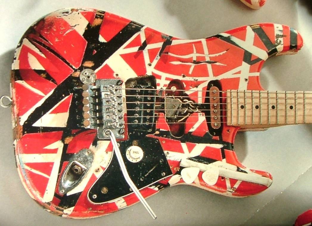
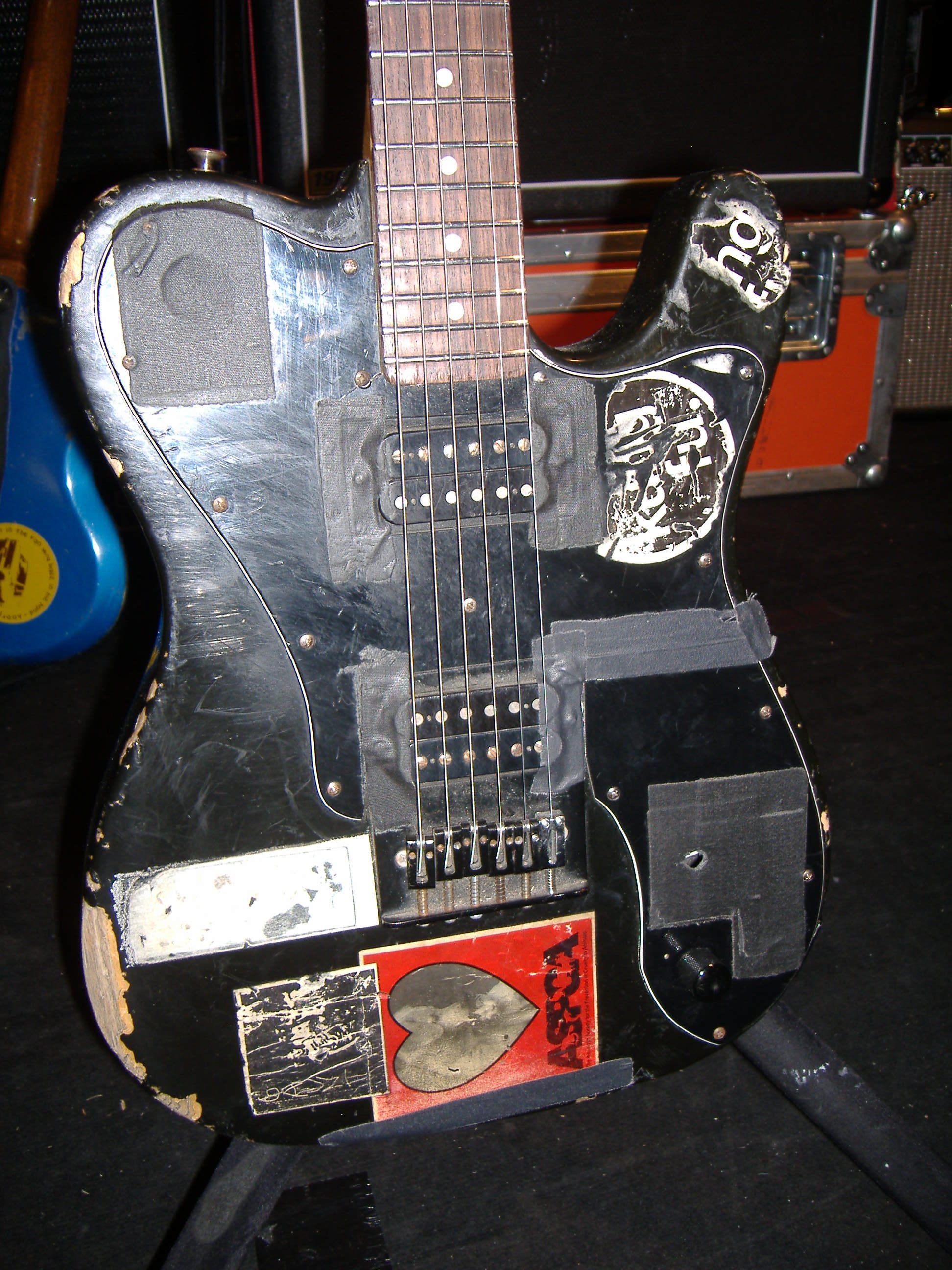
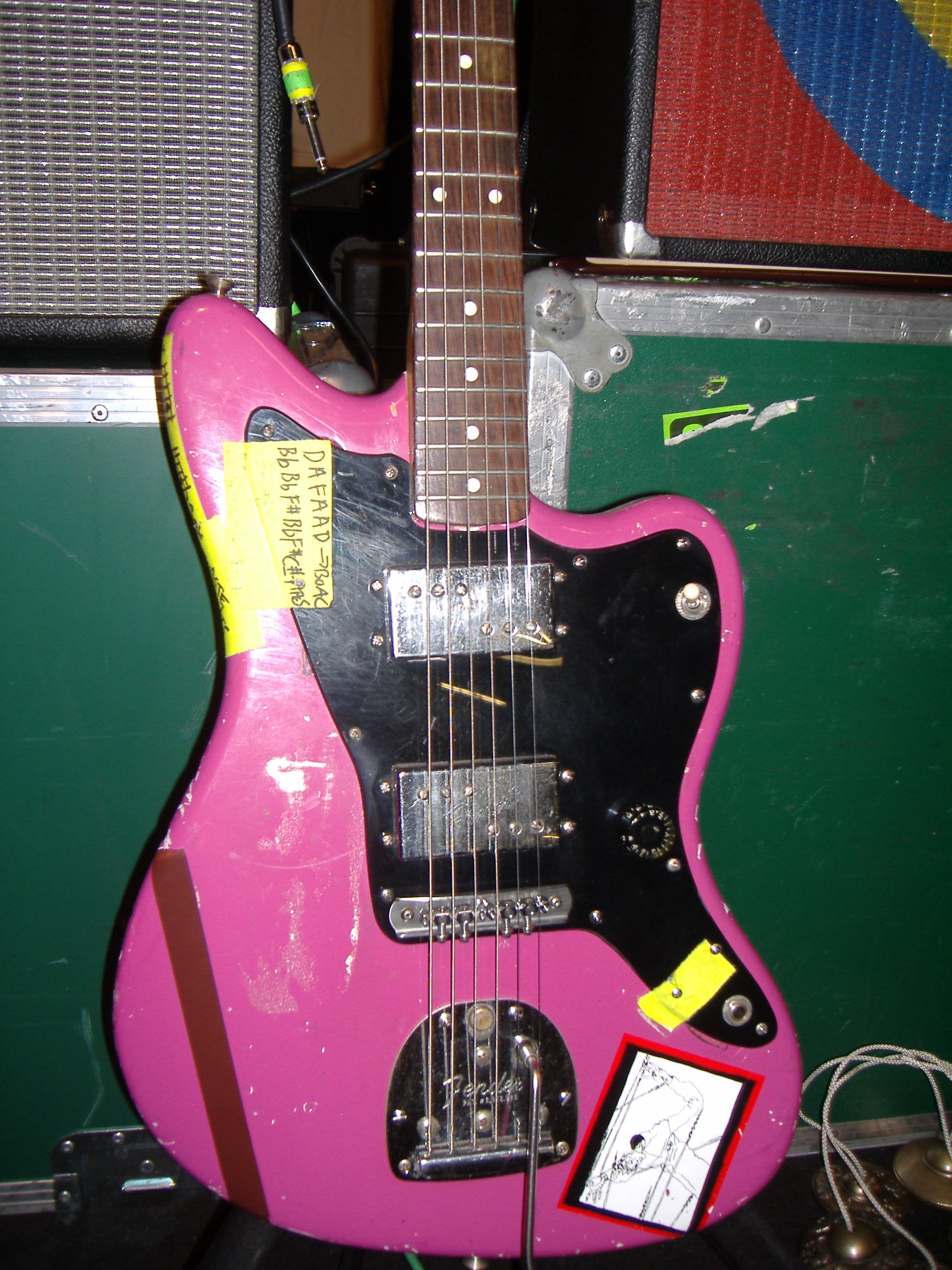
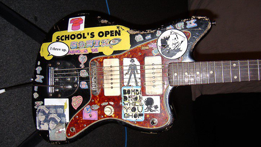
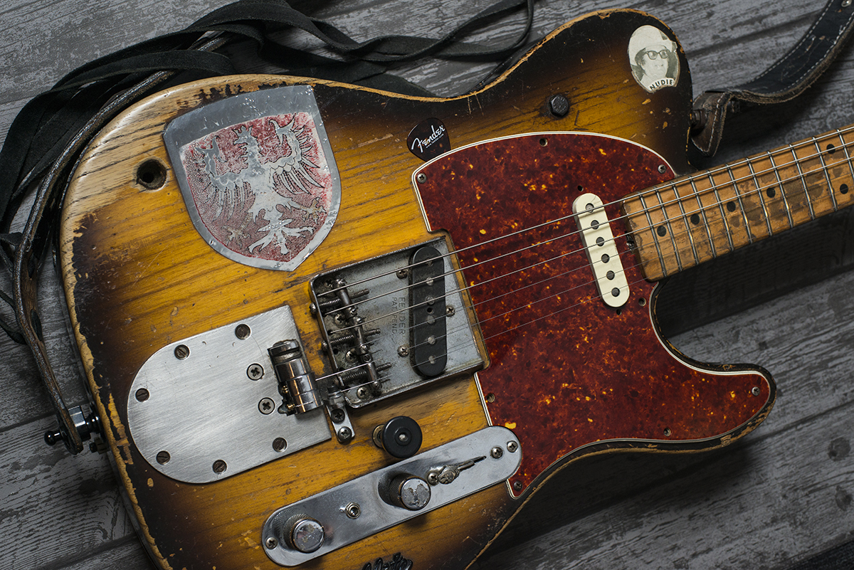
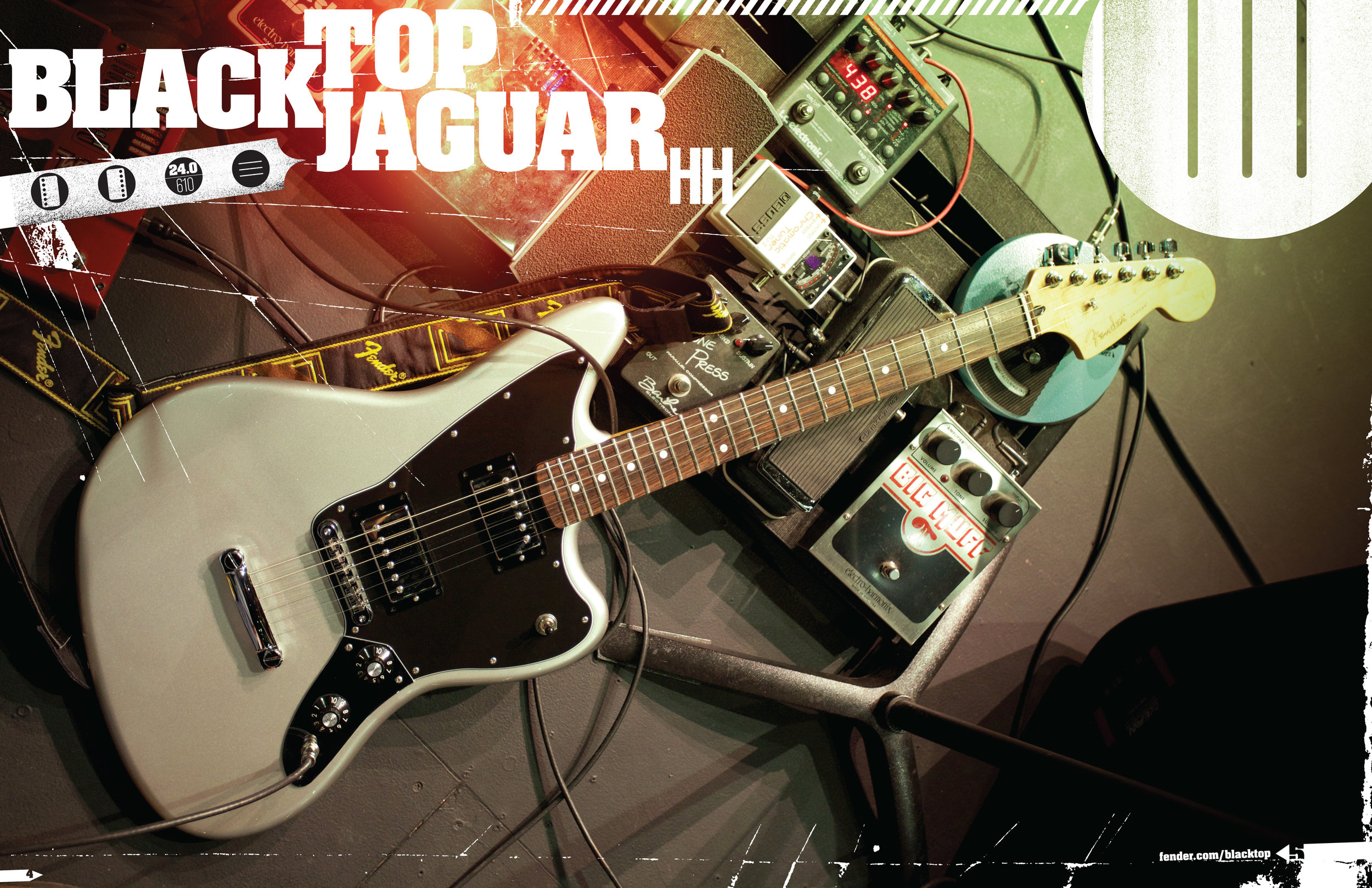
Above: instruments used, abused and modified by artists to meet their needs.
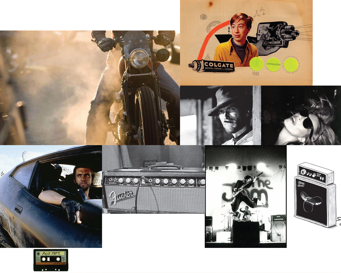
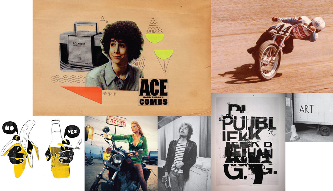
Initial Explorations
I like using a mood board for initial branding research. In particular, these explorations informed my choice for logotype and brand.
Branding Design
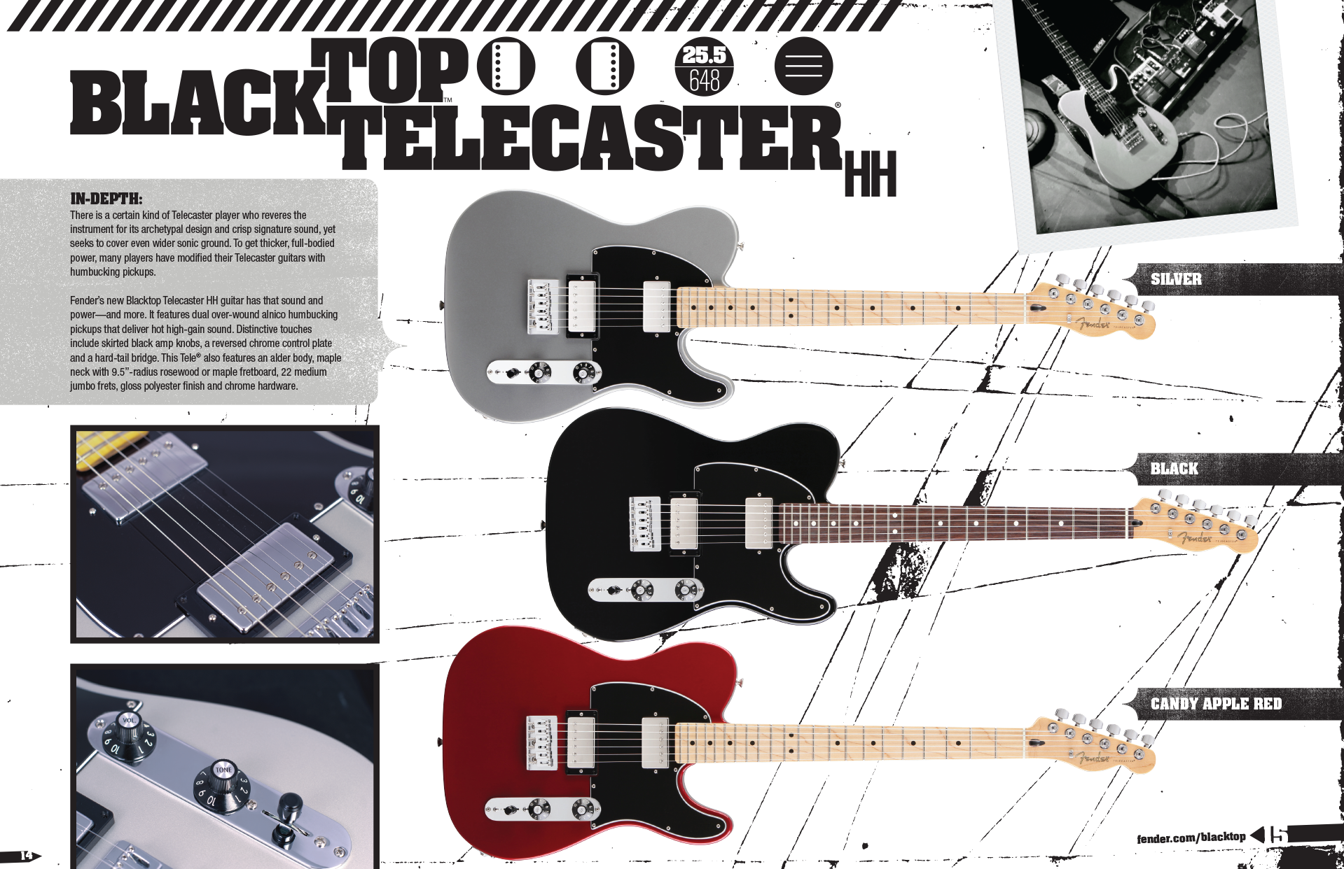
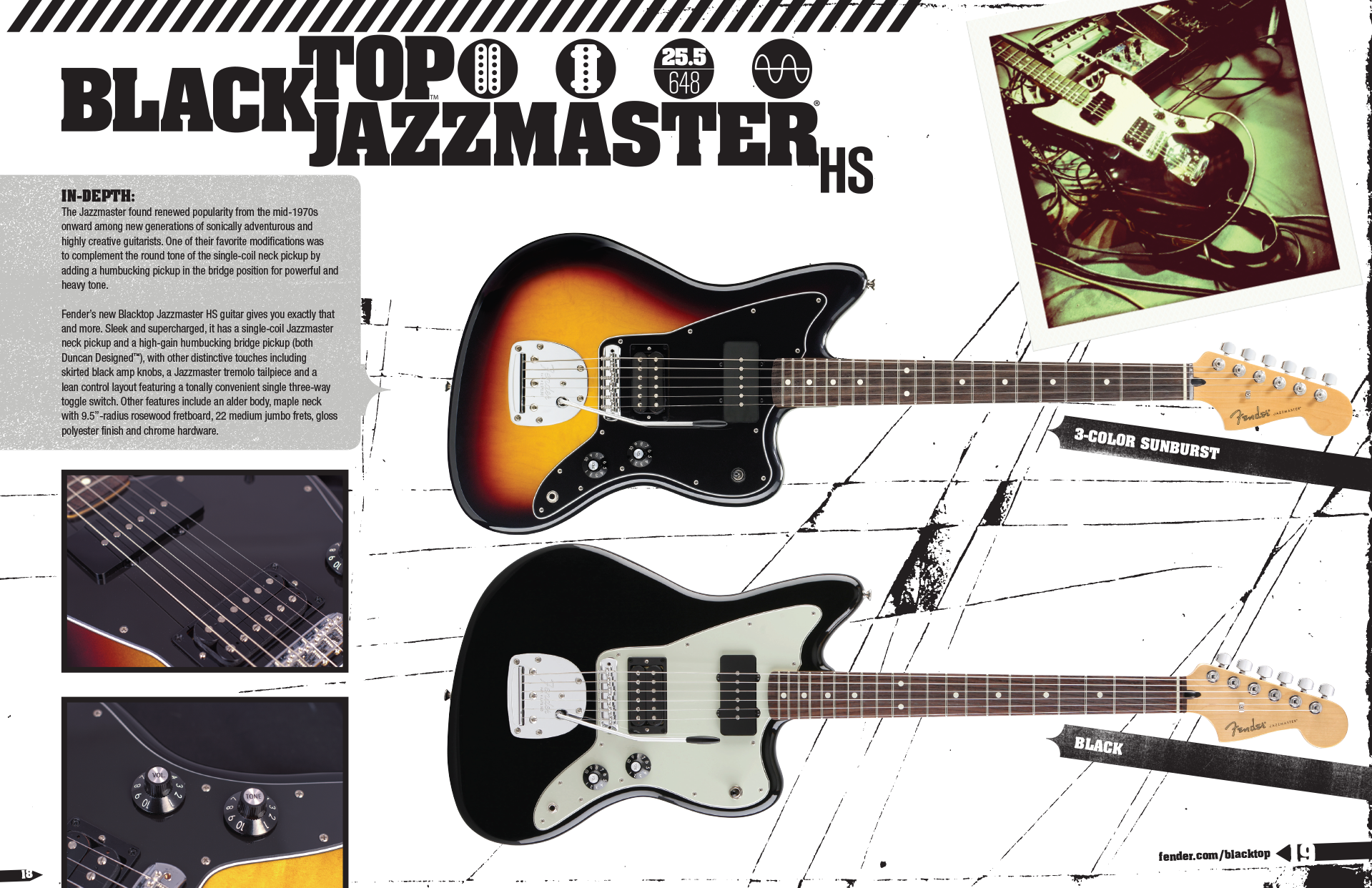
I developed a visual concept that supported the raw, DIY aesthetic that these products were inspired by. I began with a type treatment for the brand, and incorporated all the models that would be present in the series.
I also developed a visual "short hand" for describing the features and specifications of each instrument that we could use as a graphic element. When arranged properly, the icon key would tell a player everything they needed to know about the guitar's basic specs, down to the model level.

Imagery
Though the products were anticipated to be successful, there was little budget to develop marketing materials: this was a true do-it-yourself effort.
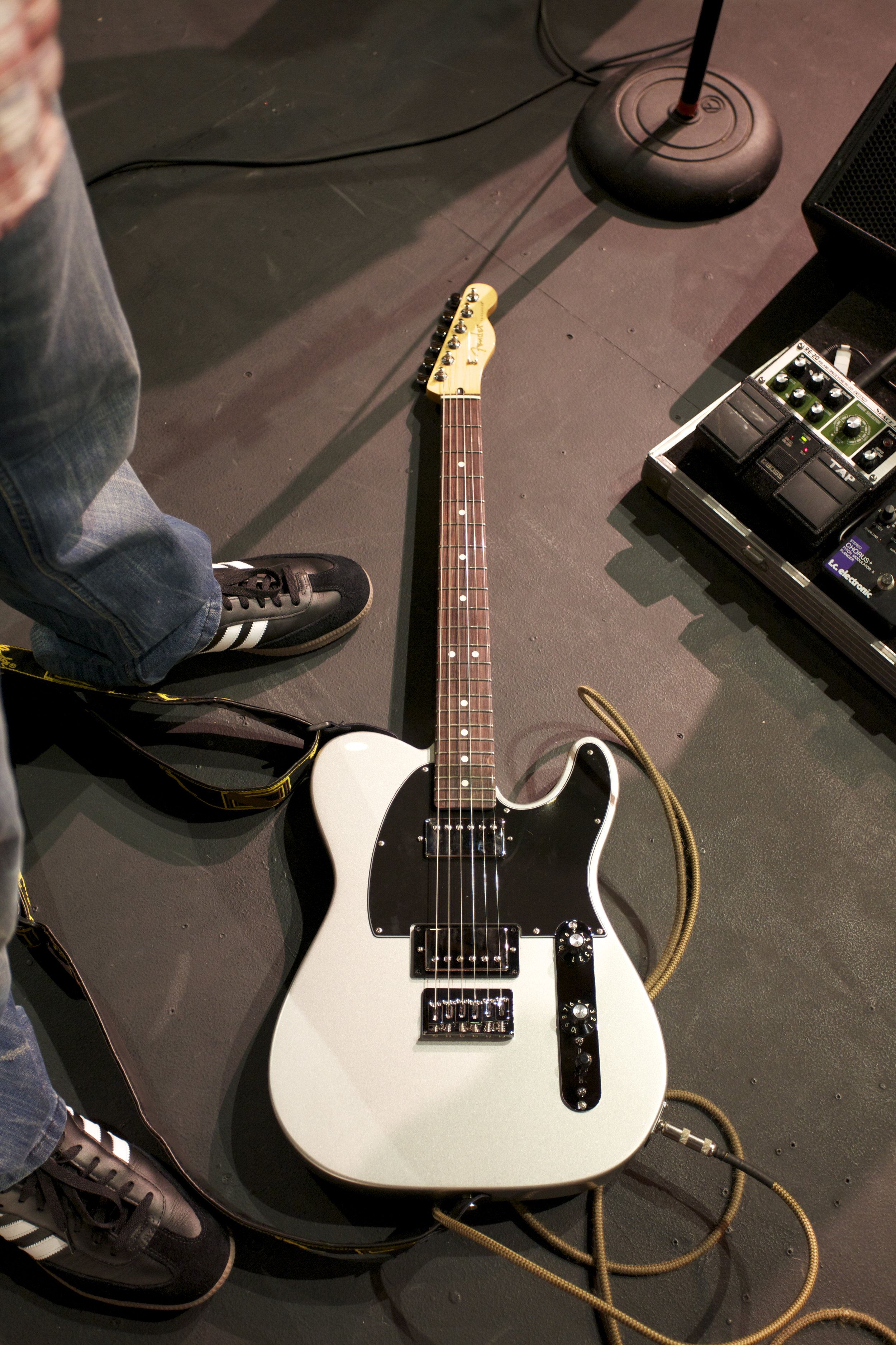
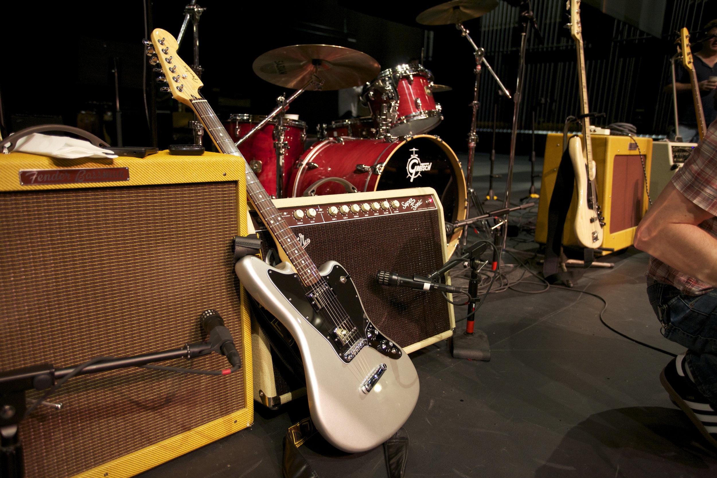
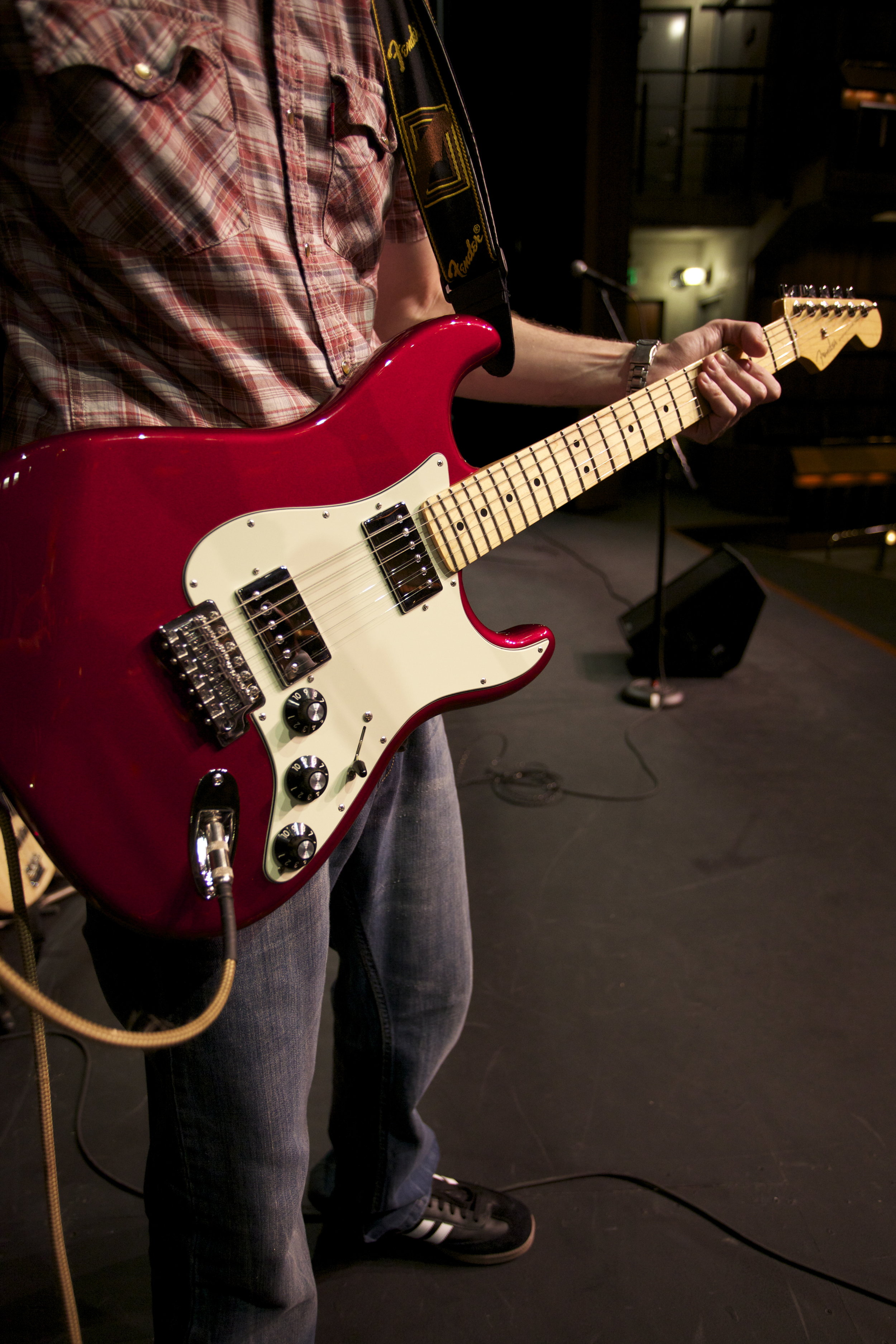
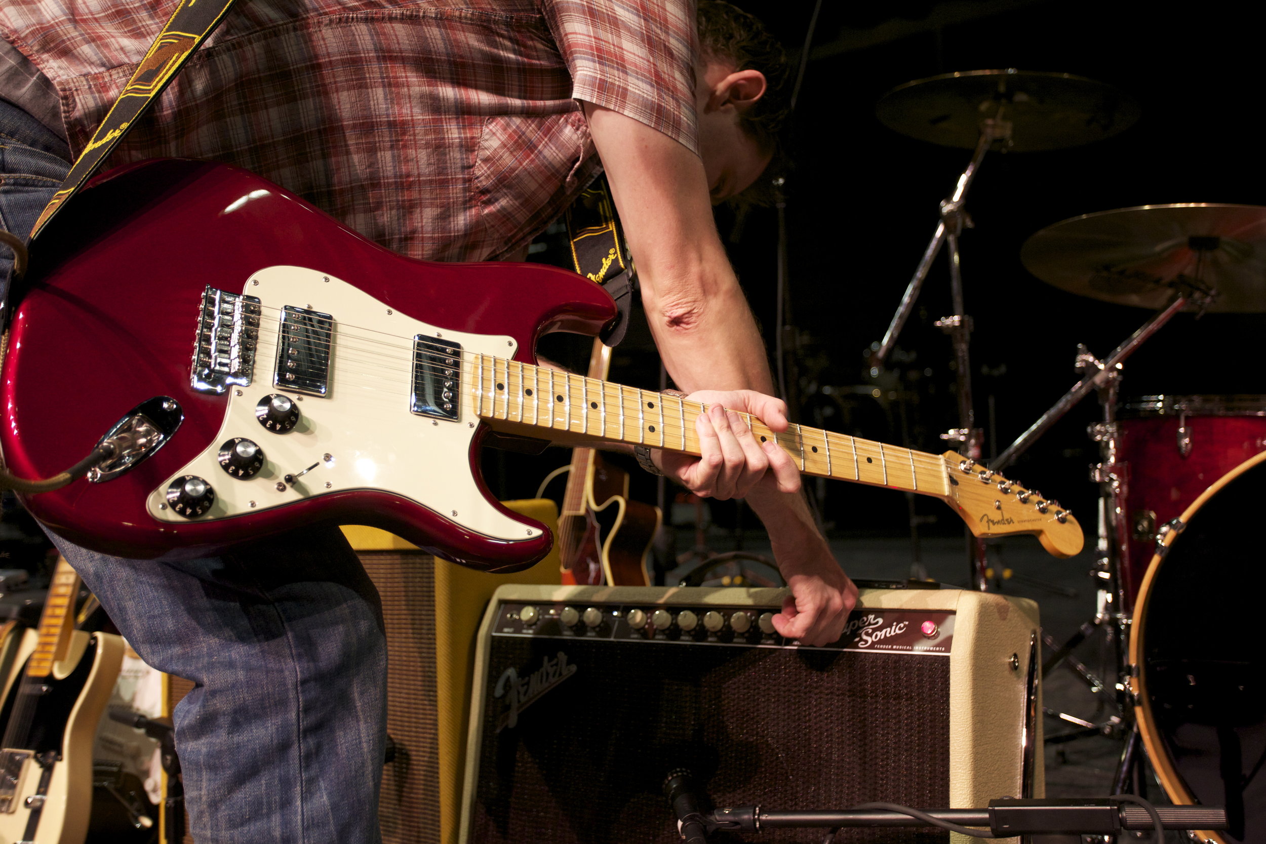
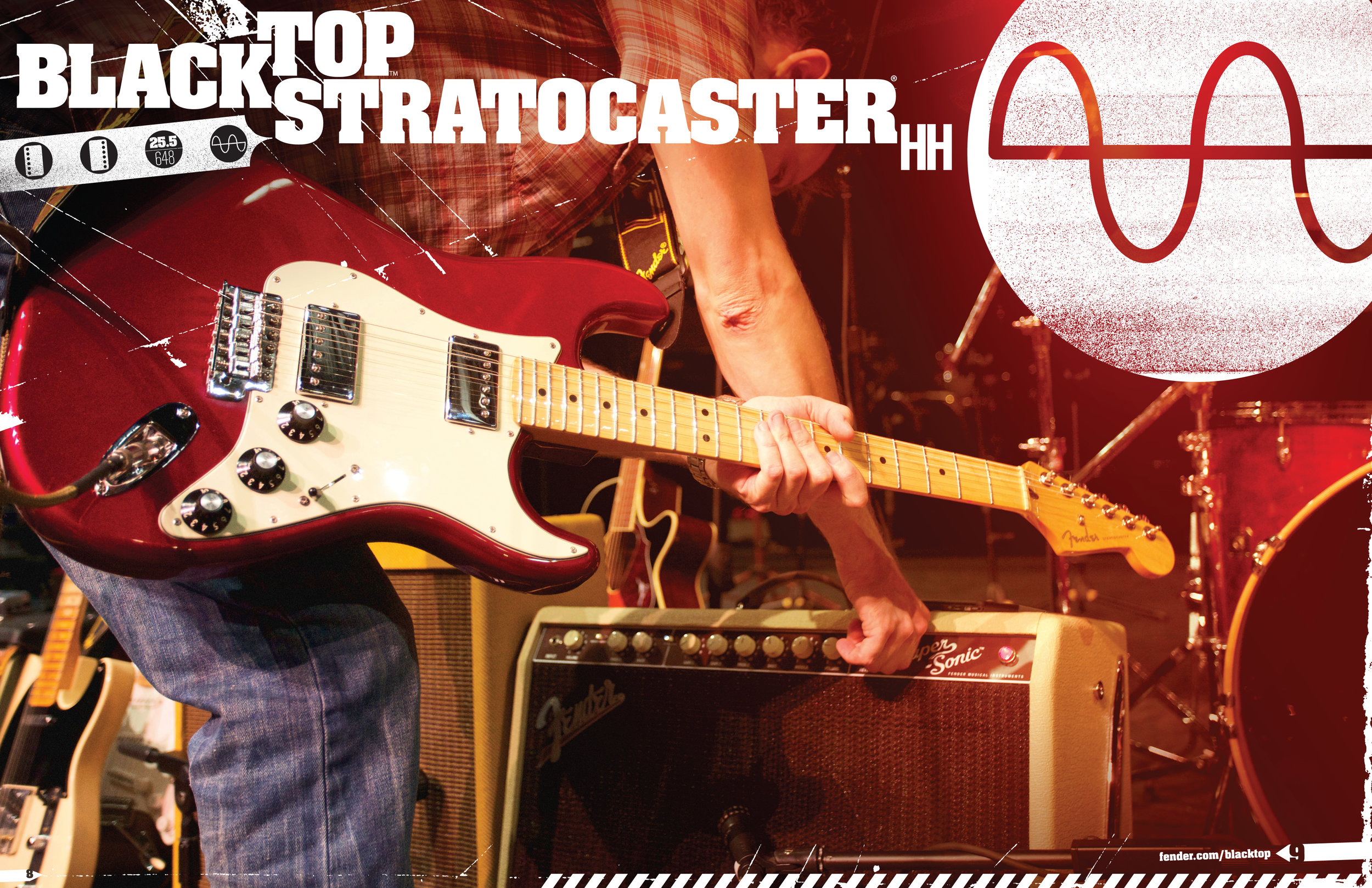
Most of the photography was shot in-house. I used concert photos taken by our A&R staff, art directed a shoot with our internal creative team, and filled in the gaps with my mobile phone.
I processed our photography with a simple, lo-fi style that paid homage to the products’ no-nonsense nature.
MarCom Materials
Taking the branding treatment and photography, I created the supporting MarCom material. This included advertising, web presence, point of sale and other collateral.
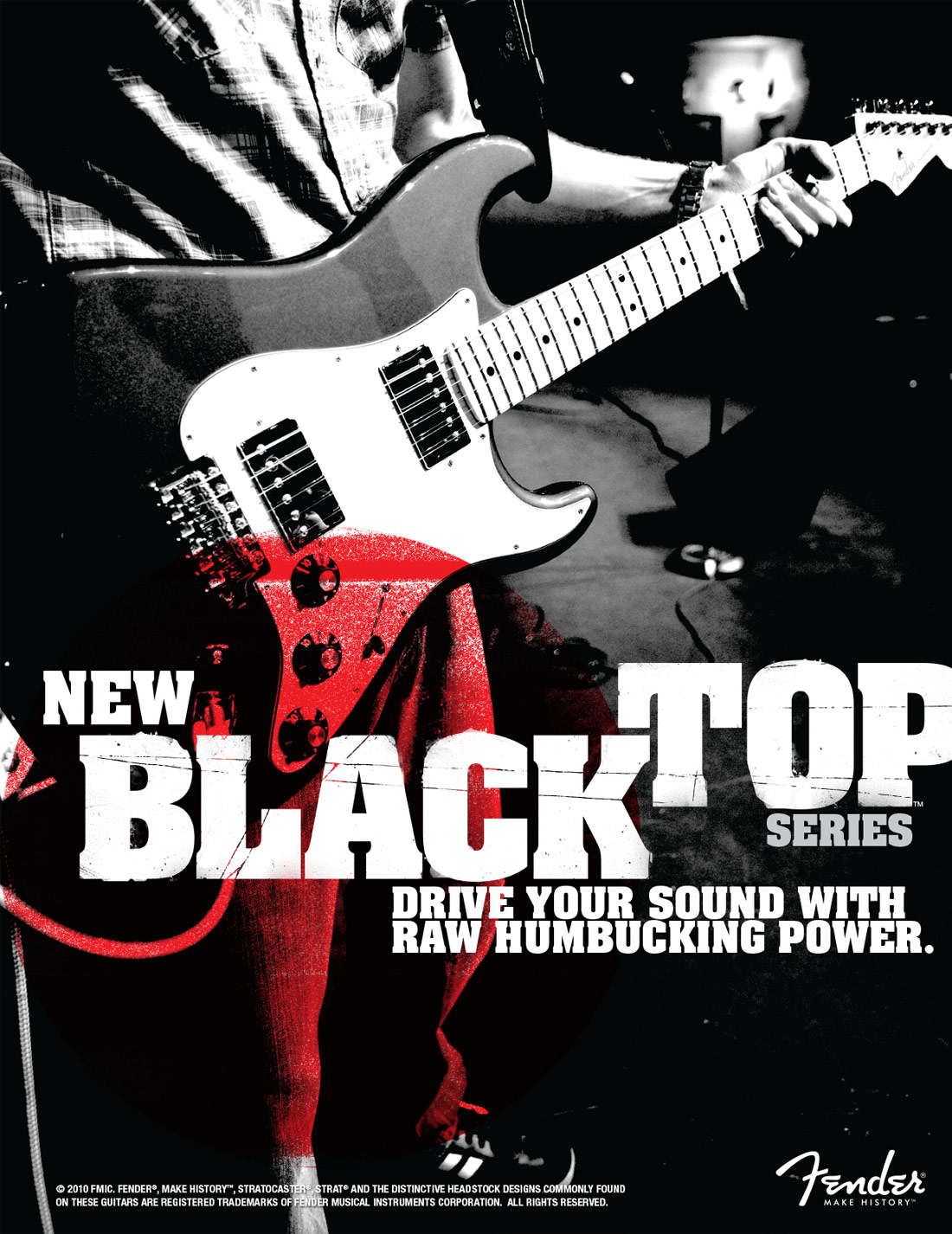
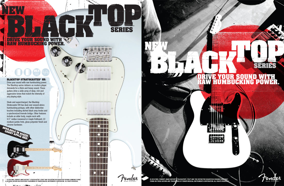
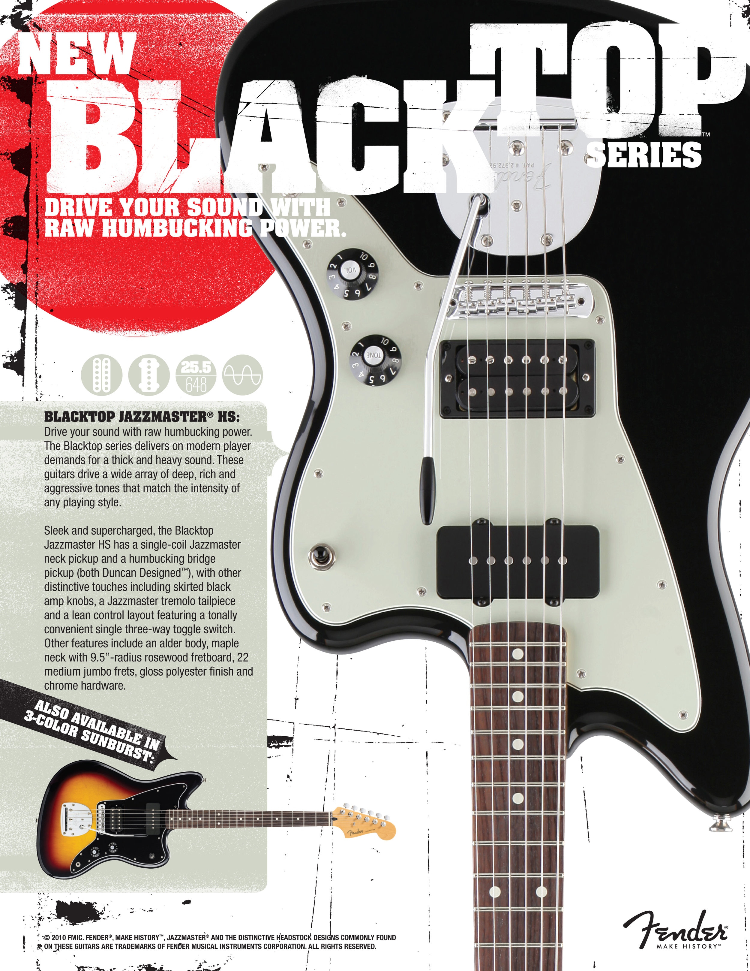
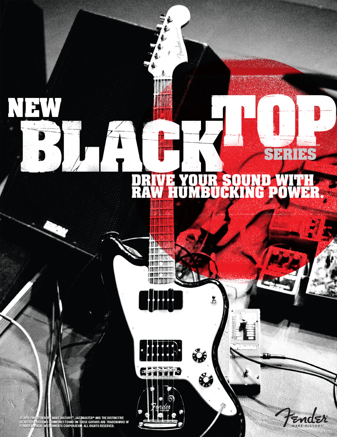
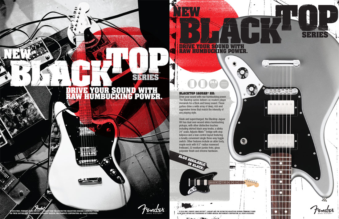
We used the same imagery from one photo shoot in both advertising and other marketing materials.

Branding elements were carried over to the Blacktop web presence as well.
