Honeywell Mobile App Design System
A design language system for Honeywell Aerospace’s pilot-facing mobile applications.
Design opportunity
Honeywell needed a consistent design language system (DLS) for their pilot-focused mobile apps. Prior to this project, there was no common design language, UI kit, or method of distribution for product creation assets.
Results
A centrally-hosted set of design assets and guidance for usage, for Electronic Flight Bag (“EFB”) applications.
01 – Design opportunity
At Honeywell Aero, we knew we needed a design system. We had several iOS applications in market (or being developed), but they didn’t share a design language.
The product teams lacked a shared resource or reference for creating these apps. Design efforts were slowed by rebuilding and reviewing of UI conventions. Customer feedback on our offerings included words like "outdated" or "ugly". Sometimes multiple apps, with inconsistent shared experiences, were used by the same persona.
Our UX team suggested a design system specifically for our pilot-facing mobile apps. If we were successful, we'd have a consistent toolkit for designers to use. It would incorporate best practice from our human factors colleagues. It would work within platform constraints. And it would align with other branding efforts underway at Honeywell. I was asked to lead this effort.
02 – Getting started

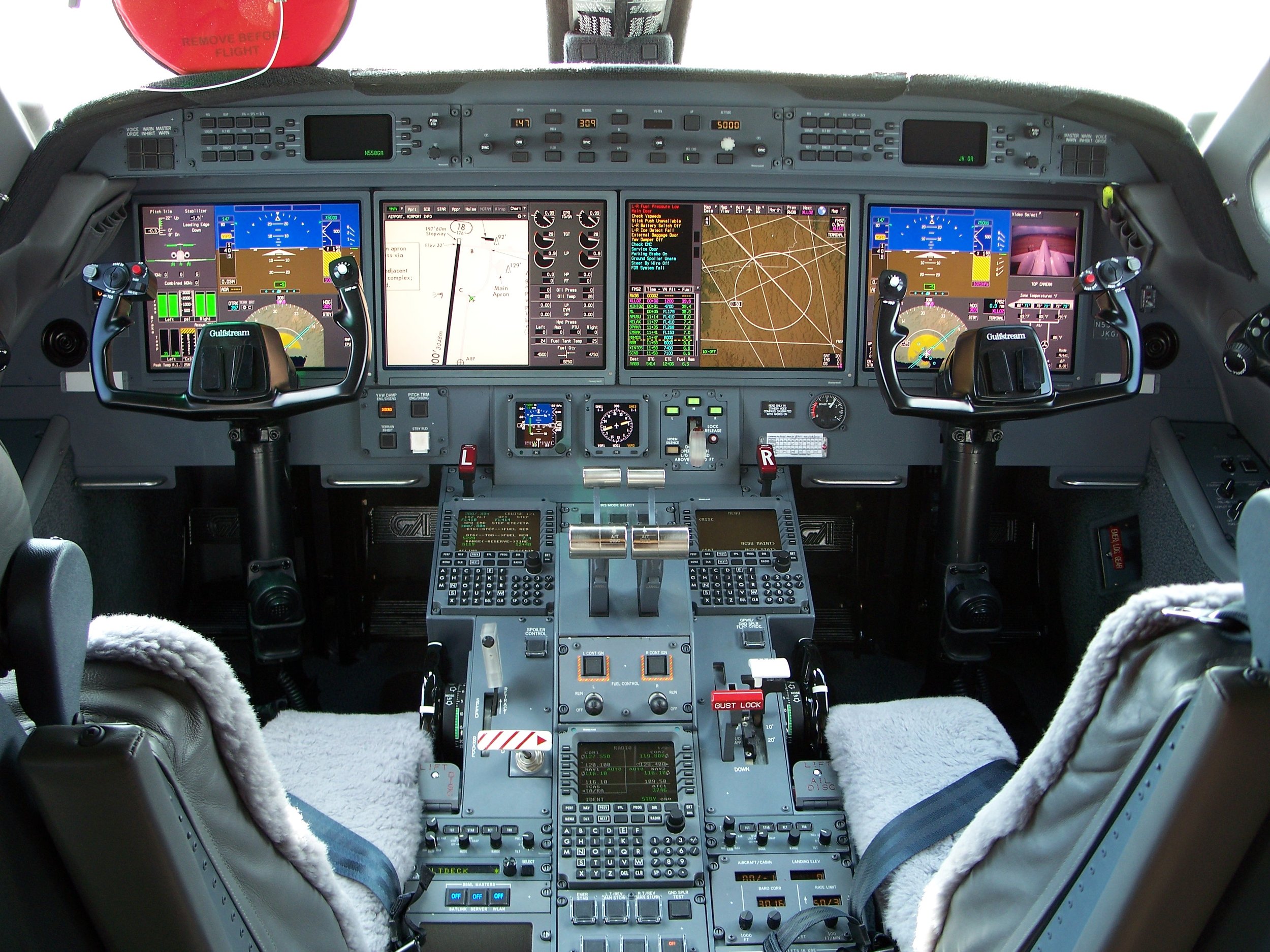
I started with an audit of our existing Electronic Flight Bag (EFB) app landscape (above). EFB apps are for strategic decision making and completion of supplemental tasks. They are common as "paper replacement" tools. Pilots may use EFBs in the aircraft cockpit as well as on the ground. Pilots use EFB apps during non-critical phases of flight (not during takeoff, landing, or other high workload scenarios).
Some findings from our EFB audit included:
Navigation and general UI patterns were different across our EFB app portfolio.
Of the apps shown above, each one used a different mapping engine in the background – some of them homegrown. A large percentage of user interaction on these applications is on a map. Conventions weren’t common across the apps, visuals were different, and performance varied as well. None of the apps shown here could share mapping resources.
Each application used a different type stack.
Aerospace symbols and iconography were also different across the board — the apps didn’t share a common icon library. So users might have to re-learn symbology from one app to the next.
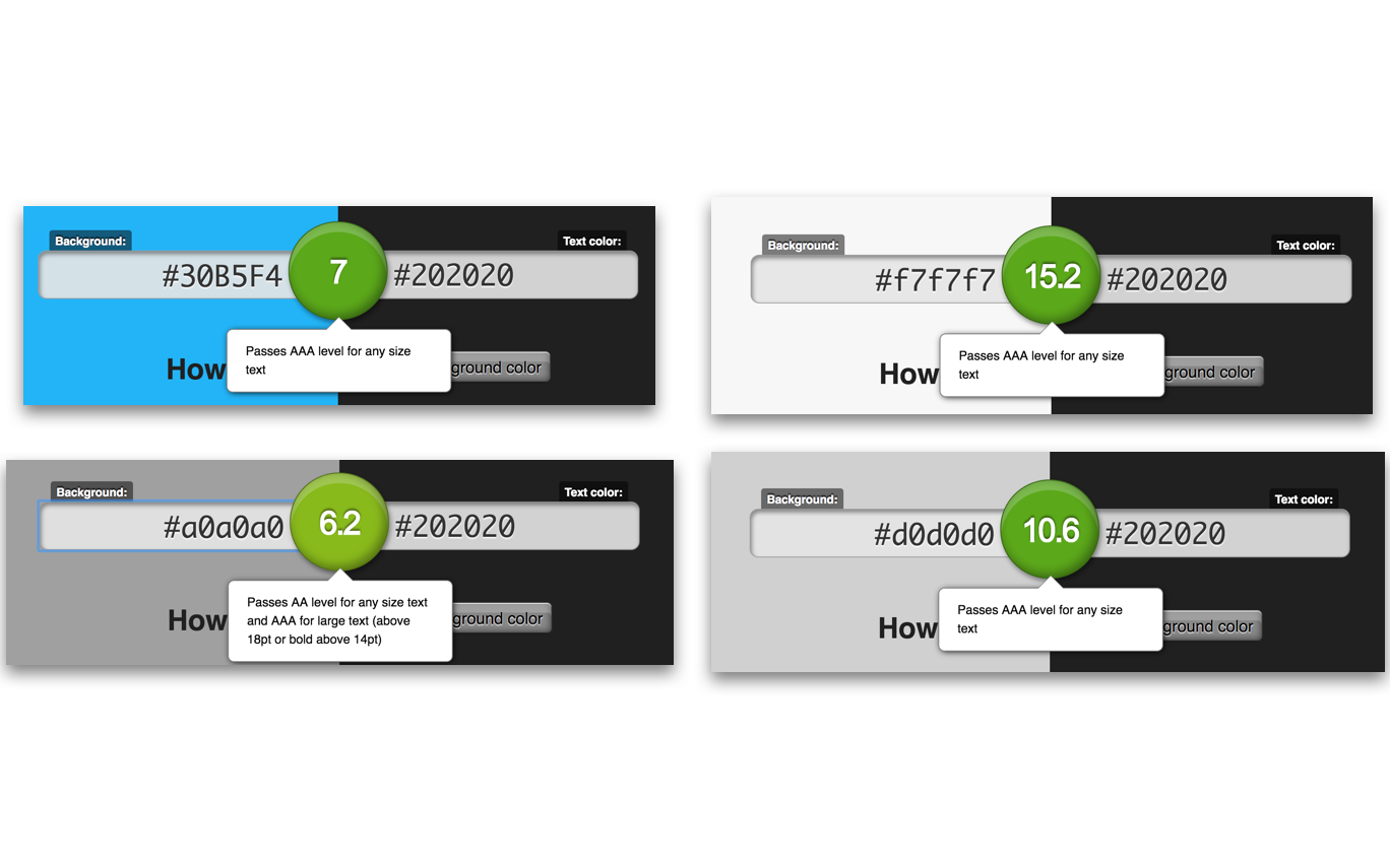
Honeywell had recently undergone a brand refresh. I incorporated some aspects of the brand into the EFB design language. Some, but not all: EFBs are part of a regulated operating environment. Honeywell human factors engineers were stakeholders to this design effort. Safety is their chief concern: our design system needed to incorporate their guidance, especially around color palettes, typography and aerospace symbology. We decided to diverge from the brand palette, where it made sense. Diverging from the brand palette needed to be defended: with the guidance from my human factors colleagues, I was able to explain the rationale for these changes:

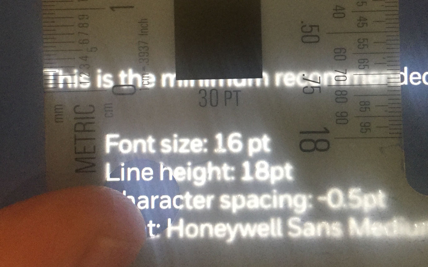
Above: A typical operating environment, testing out design concepts in a similar environment, accessibility and typography requirements.
Below: At the time, Honeywell also had different development stacks, and so part of my discovery work was to understand these environments, and propose consolidation options. A single mapping engine (instead of several) was an example of such efforts.

03 – Building the system
This early work, supported by our human factors colleagues, formed the principles underlying the system.
Up to this point, I had been gathering research and iterating on the system principles. Now it was time to create the components. We didn't have a dedicated design system team, so I gathered our product designers for a week-long design sprint. Over the course of a week, we designed a Sketch component library, based on the principles I'd outline. To speed things up, I created a “starter” Sketch file with our approved color palette, typography and aero symbology. Each day we'd end with a review session, inviting our human factors colleagues in for feedback.
This rapid sprint compressed the timeline usually required for creating a component library. It helped that we designed for iOS only, and could leverage platform conventions.
Our first output was a basic set of UI components for Sketch users. I followed this up with additional releases, including maps, weather, iOS-specific components, and other custom components.

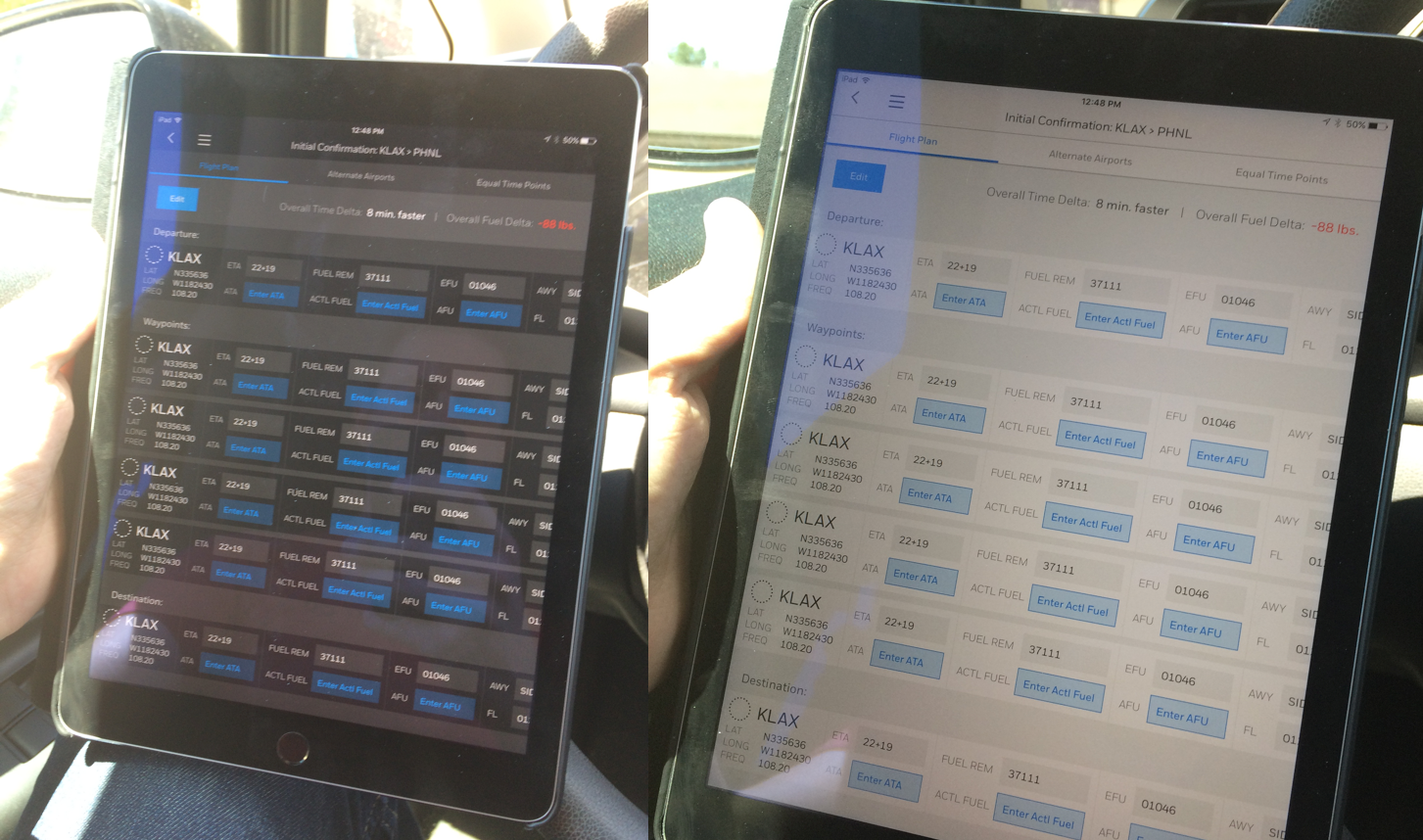
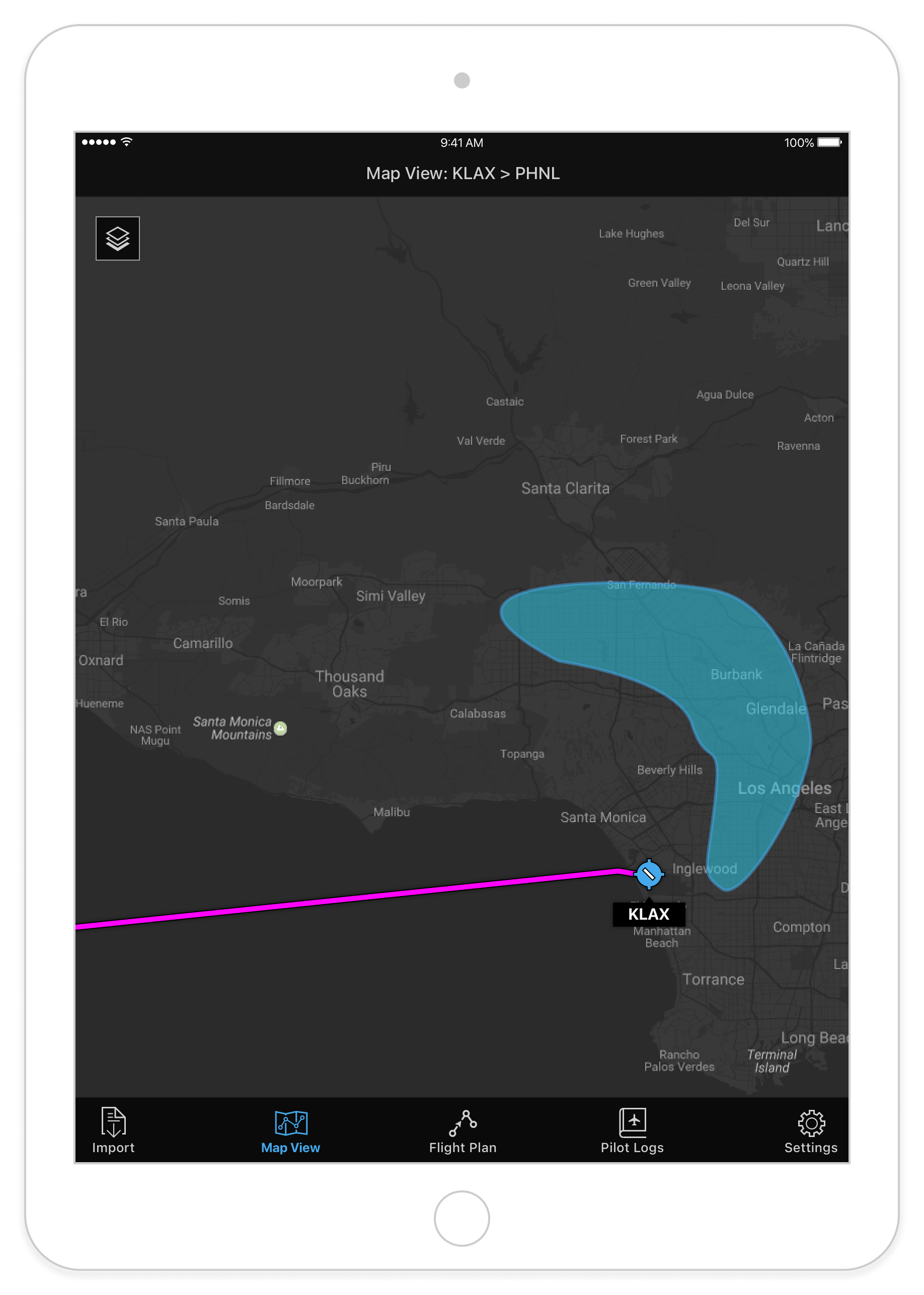
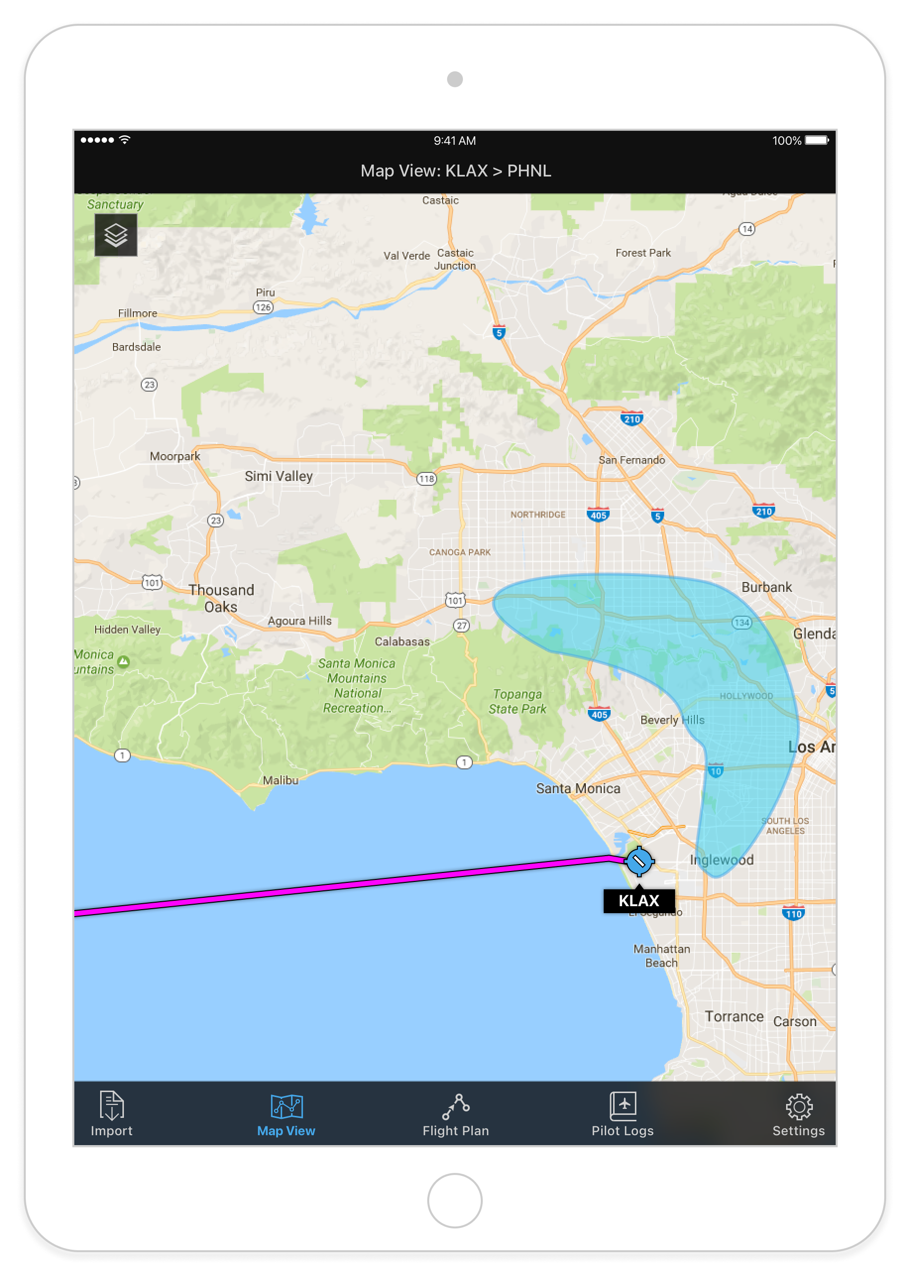
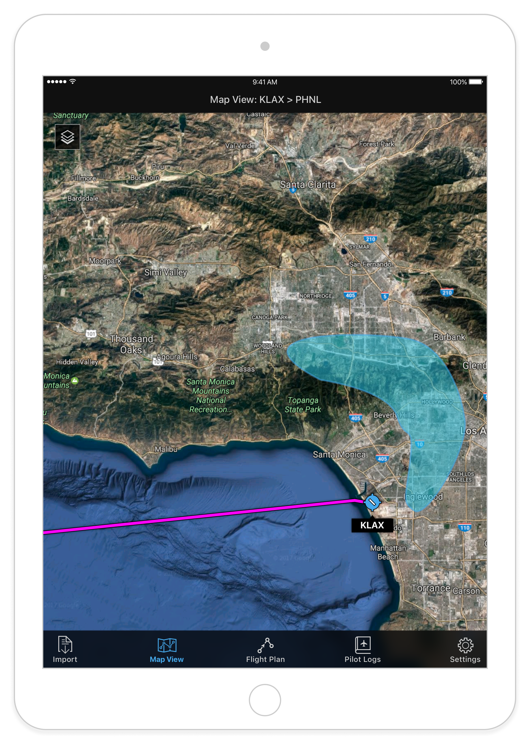
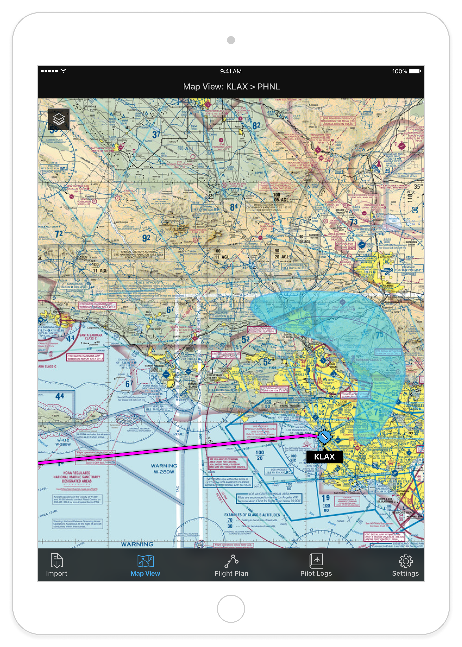
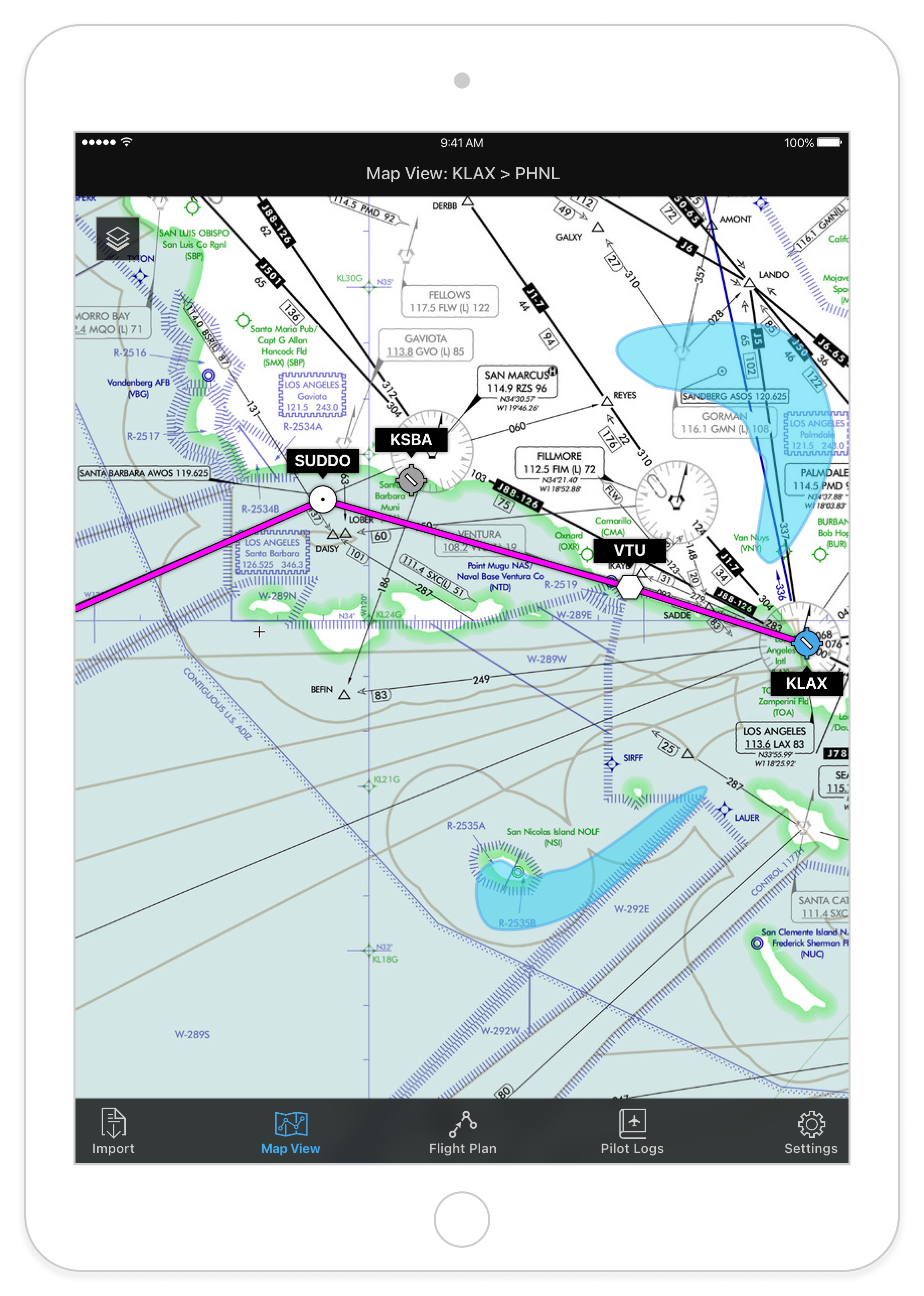
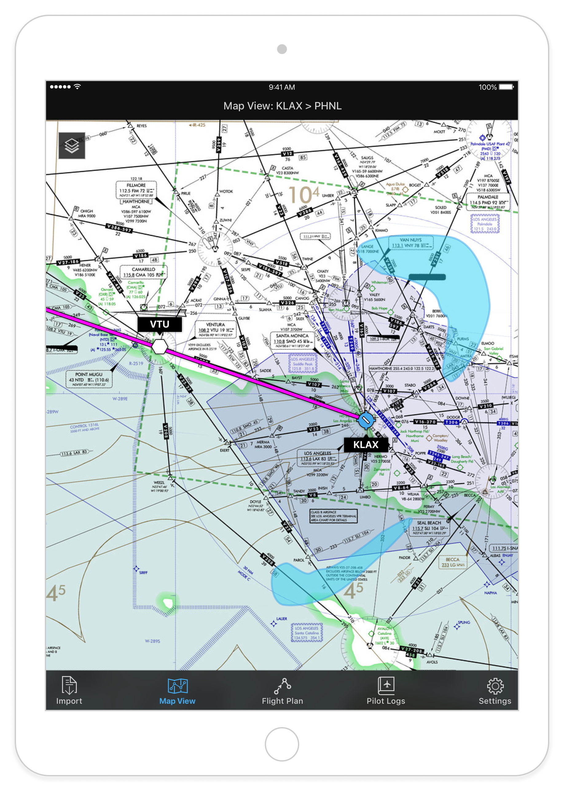
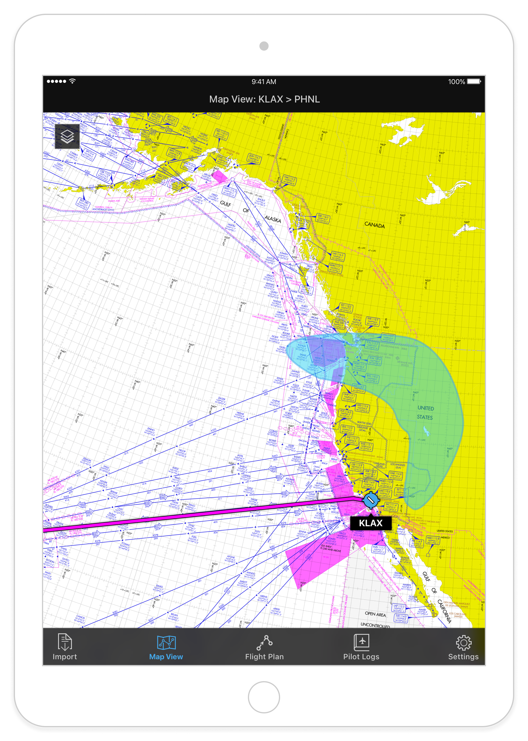
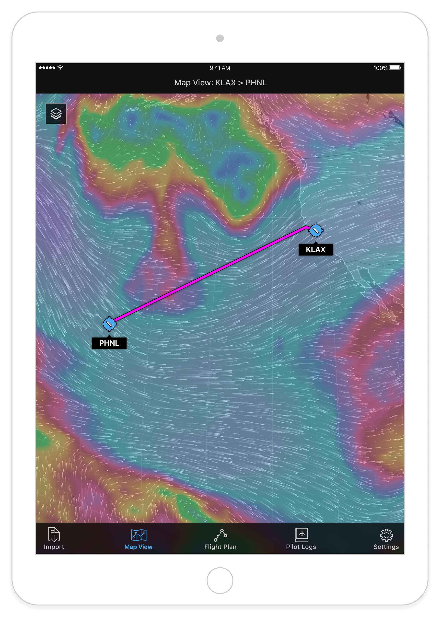
Map examples, using a common mapping service:
The internal documentation site:

04 – Results
Was this successful? Mostly, yes. We did end up with a reusable, accessible, on-brand component library, shared across the design team. We included basic usage guidelines, in the form of an internal website. We also included basic build docs (“redlines”) for adopting engineers. For designers, this was useful and time-saving: no more recreating assets. Many of our learnings from working with human factors were baked into the system, so users of the system got the benefit of human factors expertise for "free".
So what would have made this more successful? There were no iOS developers dedicated to the project. There wasn't a common repo where a dev team could go pull down the code equivalent to the "source of truth". So early adopters still ended up reinventing the wheel, to some extent. This later became less of an issue as Honeywell's EFB portfolio began to standardize, and developers were able to share code assets.
A few “before/after” images:


